

From Analysis to Action: Improving Your B2B Industrial Website’s Content Performance


Great content is one of your most valuable marketing assets—but only if you know how it’s performing.
Content is central to any B2B industrial marketing strategy. It powers inbound marketing, ABM, and sales enablement, and it does the critical work of engaging prospects before they’re ready to talk to sales, building trust, and positioning you as an expert who can help solve real problems. For many industrial buyers, your content is their first—and most lasting—impression of your company.
It’s also one of the most time-consuming assets to produce. The good news: content doesn’t have to be perfect to be valuable. It’s one of the easiest assets to improve incrementally, which means continuous improvement is achievable through quick wins over time. But those wins depend on knowing where to focus.
That’s where analysis comes in. A clear picture of what’s working—and what isn’t—helps you prioritize updates that actually move the needle. Sometimes a small change is enough to move a page from the second page of search results to the first. And finding patterns in your current performance helps you steer new content toward better results from the start.
- Setting goals for content performance — prioritizing metrics for B2B industrial websites
- Choosing your tools to measure content performance
- How to analyze performance with each tool
- Pairing analytics with positioning and intent
- How to update existing content for better performance
- How to use analytics and content analysis into ongoing performance gains
- Identify your content gaps
- The long view
Setting goals for content performance — prioritizing metrics for B2B industrial websites
Because modern marketers have so much potential data at their fingertips, it’s easy to fall into a rabbit hole of irrelevant information instead of focusing on the metrics that matter most. Reading general best practices articles can be helpful, but your goals as a marketer for a B2B industrial, manufacturing or technical company are likely to be different from the goals of a marketer for, say, a consumer packaged goods brand or a restaurant. Content performance metrics for B2B and industrial marketing generally align with leading indicators and lagging indicators that point to a higher quantity and quality of leads from your website—both MQL conversions and SQL conversions.
While social media is an important avenue for amplifying your content’s reach and finding new audiences, and email marketing and ABM strategies also heavily involve content, this article focuses primarily on the content housed on your marketing website. Your industrial website is the hub of your marketing, and content initiatives typically link back to it, so it’s usually where we advise our clients to focus first.
Choosing your tools to measure content performance
With seemingly endless analytics tools available, knowing where to start can feel overwhelming. If you’re new to this, begin with Google Analytics. Once you’re comfortable there, layer in the other tools as your needs grow.
Here are five worth knowing:
1. Google Analytics
The most widely used tool, and free. Google Analytics tracks where your visitors come from, how they find you, what pages they land on, which pages they view most (or spend the longest on), and which pages drive conversions.
Two reports are especially useful to start:
- Audience Overview: shows traffic quality through metrics like engagement rate, average engagement time, and views per session
- Acquisition Overview: shows which channels (organic search, paid search, referral, etc.) bring traffic to your site
2. Google Search Console
The go-to tool for organic traffic trends. Impressions, Clicks, and Average Position show how well your keyword strategy is working. Search Console also surfaces technical issues that can hurt site performance—issues that Google Analytics won’t catch.
3. SEMrush
One of the strongest all-around SEO tools for understanding keyword and content performance. Use it to shape your strategy, track rankings, and benchmark against competitors.
4. HubSpot
If you’re already using HubSpot as your CRM and marketing automation platform, it extends analytics further into the buyer journey. You can see how your MQLs and SQLs initially converted, then track how they’ve engaged with your marketing since.
5. HotJar
To understand how visitors actually interact with a page, HotJar and similar heatmapping tools show where people move their mouse, where they click, and how far they scroll. This surfaces friction points that traffic data alone won’t reveal.
How they fit together:
Here’s how each tool fits together:
- Google Analytics measures clicks and visits to your site
- Google Search Console shows how often you appear in results for a given search term
- SEMrush tracks your rankings for a given term
- HubSpot connects site activity to your CRM, showing how MQLs and SQLs engaged before and after converting
- HotJar shows how visitors behave on the page itself—where they click, scroll, and get stuck
If you’re just getting going, don’t try to adopt everything at once. Start with Google Analytics and Google Search Console—both are free and give you the foundation you need. Add the others as your goals and marketing maturity grow.
How to analyze performance with each tool
Using Google Analytics (GA) to understand your current content performance
Google Analytics shows you who’s visiting your site, which pages get the most attention, where visits come from, and which channels are driving results (organic search, paid ads, social, email, referrals, or direct visits).
Focus on four key areas: traffic, landing page performance, engagement, and key events/conversions.
1. Measuring traffic
Start with the Traffic Acquisition report: Reports → Life Cycle → Acquisition → Traffic Acquisition
This shows aggregate numbers and trends for all visits to your site. Click any channel name to see trends for that channel over time. Set the date filter to the last 365 days for big-picture trends, or narrow it to a specific period for closer analysis.
2. Measuring landing page performance
See which pages are bringing in the most traffic: Reports → Life Cycle → Engagement → Landing Page
Beyond the sessions metric, pay attention to:
- Engagement rate → higher is better
- Average engagement time per session → higher is better
- Key events → higher is better
These numbers tell you whether visitors are engaging with your content and exploring your site, or leaving quickly because they didn’t find what they expected. To isolate organic traffic, select “Add comparison +” at the top of the screen and choose the Organic Traffic segment.
3. Measuring content engagement
The same engagement metrics—engagement rate, views per session, and average engagement time per session—can be applied to specific content sections, not just the site as a whole.
If your case studies share a URL structure like /case-studies/, within GA4 you can go to Reports → Engagement → Pages and screens, then filter by page path (e.g., contains /case-studies/) to see how a specific content section performs.
Then ask: does this match your goals? Are qualified prospects interacting with your site the way you want them to?
4. Measuring key events/conversions
Assuming conversions and key events are set up properly, Google Analytics can show you which visits and patterns drive them. For most B2B industrial sites, conversions mean:
- Filling out a sales or quote form (SQL)
- Registering for a webinar or gated content (MQL)
Most reports include columns for key events. Look for patterns: which channels drive the most conversions? Which individual pages or page types consistently convert? Are you missing tracking for any key events or conversions that need to be set up?
Key Google Analytics Reports:
Reports → Engagement → Pages and screens shows which pages get the most visits and how visitors engage with them. This one report helps you spot both your strongest performers and the pages that need work.

Using Google Search Console (GSC) to understand your current content performance
Search Console somewhat overlaps with Google Analytics, but it offers one thing neither Analytics nor SEMrush can: impressions, aka how often your site appears in search results, even when no one clicks.
Key Google Search Console Reports:
Go to Performance → Search Results for the core view. It tracks four metrics over time:
- Clicks: how often someone clicked through to your site
- Impressions: how often your site appeared in results
- Click-Through Rate (CTR): clicks divided by impressions
- Average Position: your average ranking for queries where you appeared
Break the data down by Queries or Pages for the most useful content insights.
 What to look for:
- High impressions, low CTR.
You’re showing up but not earning the click. Often a title tag or meta description problem. Is your meta description enticing? - High impressions, low position.
Google sees you for the term, but you’re not competitive yet. A good candidate for content improvement with an emphasis on optimizing around keywords. - Unexpected queries.
You may be ranking for terms you never targeted—worth leaning into with dedicated content.
One note: if your content appears in Google’s AI Overviews, those impressions and clicks roll into the standard Performance report rather than breaking out separately.
Bonus: Technical Health
Search Console also flags technical issues, like crawl errors, indexing problems, Core Web Vitals, and more, that can quietly hurt your rankings. Check the Indexing and Experience sections periodically.
Using SEMRush to understand your current content performance
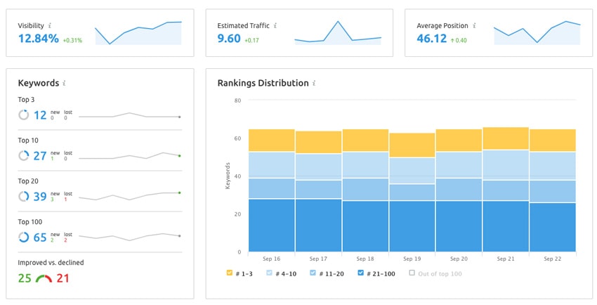
SEMrush helps you track how your content ranks over time for specific keywords and surfaces opportunities to improve. Three features are especially useful:
- Position Tracking: Set up a “project” for your site and add keywords you want to monitor. You’ll see how you currently rank, which pages are pulling those rankings, and how rankings are changing over time.
- Keyword Gap: Compare your ranking keywords against competitors’ in a Venn diagram to spot topics or specific terms that may be worth targeting on your own website.
- Site Audit: Dig into technical issues page by page; 404 errors (often a sign of missing redirects), broken internal links, and other technical problems hurting performance that may be easy to resolve.
The On Page SEO Checker report also generates content improvement ideas for specific pages.
Key SEMrush Reports:
Open your project and go to Keyword Research → Position Tracking to see overall trends, top keywords, and keyword gains, as well as any losses in the “landscape” tab. Go to the “pages” tab to see how each individual page ranks.
Using HubSpot to understand your current content performance
If you use HubSpot as your CRM and marketing automation tool, it shows you which gated content assets drive the most MQL conversions, and which of those MQLs later turn into deals and signed contracts.
The key difference from Google Analytics: Analytics tells you about all visitors, while HubSpot tells you specifically about the ones who convert. Pairing the two lets you check your assumptions about which channels actually produce qualified leads and closed deals, not just traffic.
This kind of closed-loop reporting can reshape how you prioritize your marketing efforts. For a step-by-step walkthrough, see our article on Improving Lead Quality With Closed Loop Reporting.
Key HubSpot Reports:
To pull a quick view of deal quality:
- Go to the Deals section of your HubSpot account
- Apply the Create Date filter and choose your date range (e.g., “Last Week”)
- Click Table actions → Export view to download as XLSX or CSV
- Filter the results by current clients and newly acquired leads
This helps you evaluate how new leads are finding you and spot patterns in lead source and quality.
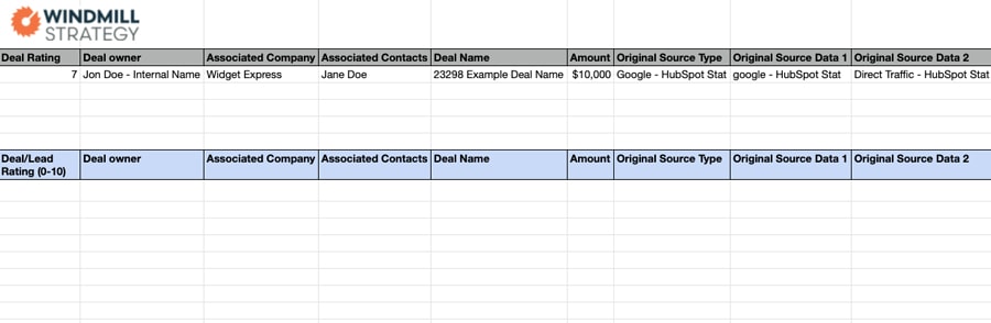
Bonus: Download your own copy of our Deal Quality Template
Using HotJar to understand your current content performance
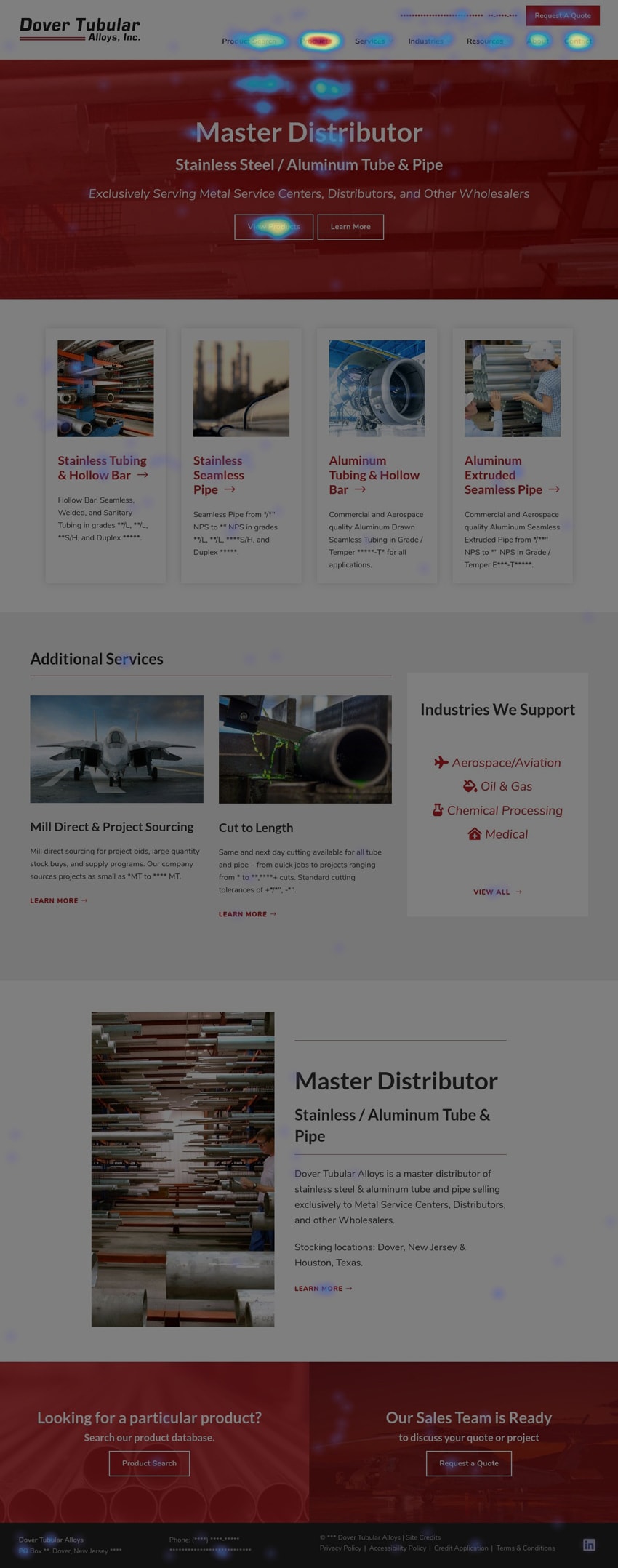
HotJar shows you how users actually interact with your pages—where they click, how far they scroll, and where their attention lands. This is visual data that traffic reports can’t give you.
A few things heatmaps commonly reveal:
- Unexpected click behavior. Users often click on things that aren’t links. For example, client logos on a homepage may get clicked by visitors expecting to jump to a case study, whether those logos link anywhere or not.
- Device-specific patterns. HotJar captures data separately for desktop, tablet, and mobile, which often behave very differently.
Beyond clicks and scrolls, HotJar also tracks mouse movement, which hints at where users are focusing their visual attention.
Setting up heatmaps
Install HotJar (or another heatmapping tool) on a few key pages and let it run until you’ve collected at least 1,000 pageviews. Then compare mobile and desktop heatmaps and ask:
- Are users clicking where you expected or want them to? If not, calls-to-action may need to be altered or links added.
- Are users scrolling through the entire page, or stopping halfway? If they aren’t scrolling through the whole webpage, content may need to be reorganized so the most important information and calls to action appear earlier.
- Are there “frustration clicks” that suggest a confusing UX? You may need to make certain elements clickable, or restructure content to give users a clearer path.
One note: a concentration of desktop clicks near the very top of the page usually just reflects people using the main navigation dropdowns—not necessarily a UX issue.
Pairing analytics with positioning and intent
Analytics uncovers a lot of data, but it has to be viewed through the lens of attracting quality leads. If your reports show people spending time on your pages, it’s equally important to ask whether those pages are attracting the right people with the right intent.
Are the pages with the most traffic current, relevant, and aligned with your positioning? Or are they old blog articles covering topics that aren’t central to your business, outdated product pages, bios for former staff, or aging news articles? Visits to pages like these rarely convert into leads and sales.
As you review numbers and reports (quantitative data), make sure you’re also looking at things from this qualitative perspective.
How to update existing content for better performance
Once analytics tells you which pages to focus on, the next question is how to improve them. Quantitative data shows what’s happening; qualitative factors—voice, tone, positioning, scannability, SEO fundamentals, and conversion paths—often determine whether a page actually performs.
Start with your top five most-viewed pages and review each one against five criteria.
1. Content, voice, and tone
Does the page reflect your current positioning and the language that resonates when prospects talk to your sales team? Does it include relevant datasheets and 3D models? Can information buried in a PDF be surfaced as HTML?
If something feels off, walk through the page with your salespeople. Ask what they’d rephrase, what critical information is missing, and which questions they hear most often—then incorporate those answers directly into the page.
2. Scannability
Is the page a wall of text? If so, break it up with a clear hierarchy of headings and subheadings, bulleted lists, and meaningful visuals.
Skip stock imagery that doesn’t add value. Use diagrams, relevant photos, and demonstration videos to communicate your offering more clearly—and to keep visitors on the page longer.
3. Positioning
If a page has been around for a while—an older article, a resource piece, or a legacy product page—ask whether it still supports your current marketing strategy and company positioning.
If not, small updates can often realign it. For example, if an article was written to appeal to a broad audience but your company now specializes in serving the medical device industry, you can update the framing, examples, and CTAs to speak directly to that market—without rewriting the whole thing.
4. SEO
Make sure each page is built to be found by following a clear SEO strategy:
- A relevant, specific primary keyword that matches what your best customers search for
- That keyword used naturally in the title tag, meta description, H1, and body content
- Specificity that filters out unqualified traffic—”custom machine automation” works better than “automation”
However, avoid “keyword stuffing.” Robotic language turns off the humans you’re trying to convert.
5. Conversions
Every page should give visitors a clear path forward. Most B2B pages should support two types of conversions:
- SQL — for prospects with an active need (contact sales, request a quote)
- MQL — for prospects who are interested but not ready to talk (gated content, newsletter signup)
Confirm that contact options appear at both the top and bottom of the page. Then think about where your key personas would want to go next, and make those links prominent.
Always offer at least one MQL conversion. Without one, you have no way to keep marketing to interested visitors until they’re ready to buy.
Using them together:
If you’re missing elements on any of these five fronts, document what you have now, make the updates, and watch how analytics shift over time—particularly rankings and how often the page shows up as a landing page.
How to use analytics and content analysis into ongoing performance gains
Analyzing your industrial website’s content is only valuable if it leads to action. Once you understand how your content performs today, you can build a prioritized plan to improve it—and revisit your reports to track progress over time.
As you work through this process, your pages will fall into three categories. Each needs a different approach.
1. Under-performing pages: Diagnose and improve
Compare your weakest pages to your strongest. What’s different? Targeted changes to content, SEO, or UX can shift results significantly.
Watch for pages with frustration clicks—these usually signal a confusing experience or unclear CTAs.
2. High-performing pages: Build on what’s working
These pages appear often as landing pages and rank in the top 10 or 20 for your key search terms. Focus first on pages sitting just below page 1, or lower on page 1. An incremental boost here makes the biggest difference.
Ask yourself:
- Could adding video, imagery, or deeper content keep visitors on the page longer?
- Do these pages offer clear paths to related content and conversion opportunities?
- What small UX changes can you test on pages already converting well?
Small improvements on pages that already work often deliver the strongest returns.
3. Over-performing pages that miss the mark
Sometimes pages draw traffic that doesn’t match your positioning or priorities. These pages can create a real problem: in SEO, the rising tide lifts all ships, but the reverse is also true. A collection of pages with high bounce rates can give Google a poor impression of your entire site’s quality.
Start by asking whether you can modify the content to better support your strategy. If there’s no clear path to realign the page, remove it. You have two options:
- Noindex the page. The page stays on your site, but you’re asking Google to ignore it. Use this when the page still has occasional value—like a legacy product you hand-sell to a few customers.
- Delete the page. Use this when the page no longer serves your marketing mission. Submit a redirect to a reasonable alternative.
Identify your content gaps
Beyond optimizing what’s already on your site, look for what’s missing. Most companies do a solid job representing their existing products and services, but it’s easy to fall behind on newly developed offerings or case studies for recently completed projects. Industry-specific and application-specific pages tend to perform particularly well in organic search—and they build trust by showing prospects you’ve solved problems like theirs before.
Start your website content strategy with a quick content audit. Make sure each of these buckets is represented and up to date:
- Homepage: a clear overview of what you do and who you serve
- Product and service pages: higher-level overview pages plus detailed pages for sub-services or sub- categories.
- Industry, market, or application pages: often strong organic performers that show how your offerings relate to a customer’s specific needs.
- About us page: company background and history, plus any certifications, awards, etc. provide credibility and social proof.
- Contact paths: CTAs leading to contact forms and quote requests, critical to generating SQLs
- Case studies: concrete examples of how you’ve solved problems, especially recent ones, that build trust with potential clients
- Gated content: resources or tools worth trading an email address for (MQLs)
- Resource library: articles, videos, and instructional materials that provide helpful information and can often drive organic traffic.
If you don’t yet have a gated asset that can generate MQLs, that belongs near the top of your priority list.
Build a sustainable content schedule
Once you know what’s missing, create a content calendar with realistic milestones for producing new content.
Don’t just include publication dates. Add due dates for:
- First drafts
- Internal reviews and editing
- Final proofing
Aim for slow and steady progress rather than ambitious targets you can’t sustain.
As a busy B2B marketer, you have other responsibilities competing for your time. A sustainable content habit beats a one-time sprint every time. Getting the flywheel started takes effort, but once it’s turning—and your major gaps are filled—producing resource articles, case studies, and MQL-generating assets becomes much easier.
The long view
Analyzing and improving your content can feel daunting at first. But once the process is established, it becomes an ongoing source of marketing intelligence. Pair that analysis with a sustainable content calendar and you create a compounding effect: better-performing pages, a steady stream of new assets, and a clearer picture of what resonates with your audience.
Investing in this habit now will pay off for years.