
B2B Website Content Strategy – How to Organize your Homepage Website User Experience for Your Industrial Marketing Website


A smart homepage with targeted content and a clear structure is foundational to effective B2B website strategy. The website user experience on your homepage is often the first introduction to your company, and the quality of that experience will influence what visitors think of your company as a whole.
The purpose of the homepage is to quickly allow new users to orient themselves to who you are and what you do, and to show them a clear path to learn more and engage further with the content on your site. A good homepage helps a customer or prospect understand that they’re in the right place—that what you offer is relevant and valuable to their business needs.
While visual design, colors, fonts and images play an important part in this, the backbone of the experience comes from the structure & content of the homepage itself, and the organization of the site-wide navigation and content.
While every company’s ideal homepage website user experience will be—and should be—unique, there are best practices that come into play across all website experiences. For B2B technical, industrial and manufacturing marketing websites, there are certain patterns that we consider particularly useful.
By strategically defining a preliminary site architecture for your website user experience, marketers can better guide the production efforts and outcome toward a homepage experience that supports the success of the website as a marketing tool for your company. This holds true whether you work with an in-house team, freelancers or an agency.
- Best practices for B2B technical website organization
- Main navigation and site structure for a B2B industrial website user experience
- Main navigation and how to display it
- Homepage wireframe recommendations for a B2B industrial website
- Homepage hero: your positioning statement and reassurance statement
- What comes after the “hero”?
Best practices for B2B technical website organization
You may be tempted to include everything under the sun on the homepage or in the main navigation. To avoid overwhelm and clutter, think of the main navigation and the homepage as an outline of how you help people gain trust. It is important to provide multiple paths to different content and features so that people can guide their own experience, while you’re also guiding them toward what you want them to do most—which is to share their contact information, when they’re qualified and ready, as SQLs and MQLs.
One of my favorite quotes from Donald Miller of StoryBrand points out that your homepage is not the place to be cute or clever. You only have a few seconds of your visitor’s time, and you need that visitor to understand what you do, who it’s for and why they should care. Immediately. The homepage is your chance to make a meaningful first impression on your target audience with your website user experience. It’s where you generate trust with prospects and help them determine whether your company is the right choice.
Your homepage functions as an introduction to and an outline of your website. To really tailor the experience, start with a firm foundation in strategy:
- What are your overall website goals and objectives?
- Who is the website for? (Your ICP and key personas)
- What products or services are your primary marketing focus, and the basis of your positioning?
- What are the critical actions that you want users to take, in order to become MQLs and SQLs?
- What key features do you need to make prominent, to engage users?
- What content have you identified that is critical to engage, inform, and inspire users to take action?
With the answers to these questions, you can start to utilize the patterns below that we commonly implement in a successful, user-friendly B2B industrial marketing website.
Main navigation and site structure for a B2B industrial website user experience
First, the navigation must be prominent and easy to find at the top of the page. Other key components need to be prominent at the top of the page as well.
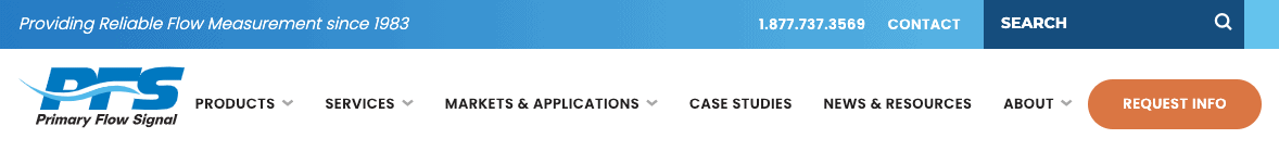
Logo, tagline and utility navigation
The top of the page is where you’ll find global elements (those that appear on every page of your website), such as your navigation, logo and a company tagline or positioning statement. This is an area of your website where you really don’t want to be unique! Stick to the patterns that people have come to expect, so that they can quickly and easily orient themselves to your site. If they’re confused, they’re likely to go elsewhere rather than dig deeper.
- Place the logo in the upper left (because people read left to right).
- It’s best to also have a tagline or positioning statement in the upper left; this communicates immediately what your company sells, and to whom, throughout the site. This is especially important for visitors who find you via search, who might experience a page other than your homepage as their first introduction to your company.
- Include a phone number in the header.
- Include necessary user login links for things like distributor portals and cart functions in the header. This area is sometimes called utility navigation.
- Position your site’s search function in the header, as well.
Main navigation and how to display it
The main navigation is the most visible organizing method for your website content, and it is a constant element throughout your website. In general, you want every page to have one place (and only one place) in the navigation. It can be helpful to think of it as a Table of Contents for your site.
When considering which items come first, think about how to organize your most critical content by importance to your key personas. These considerations and the corresponding navigation usually look like this:
- “How can you solve my immediate problem?” > Products/Services/Solutions
- “Have you solved similar problems before?” > Case Studies and/or Industries/Applications
- “How else can you help me?” > Resources
- “Tell me if I can trust your company” > About
- “OK I’m ready to talk > Contact/Get a Quote/Request Info
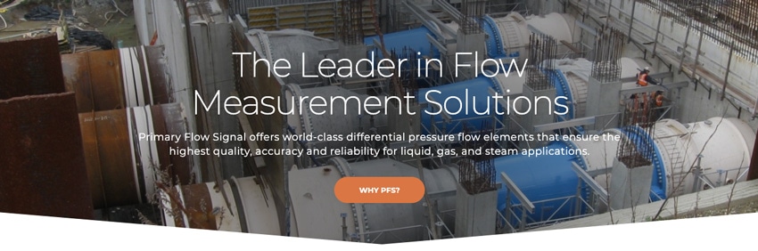
This is the basis of your main navigation. Looking again at the PFS website example, you can see this pattern in the navigation displayed across the top of the page.
As an experienced web design company, we encourage you to do the same with the main navigation on your website. Visible navigation acts as a quick visual index of your offerings; it eliminates friction in the website user experience.
We recommend avoiding the so-called hamburger menu (see below) that you experience on your smartphone, for the desktop version of your website. This navigation is perfect, of course, in the mobile experience itself.
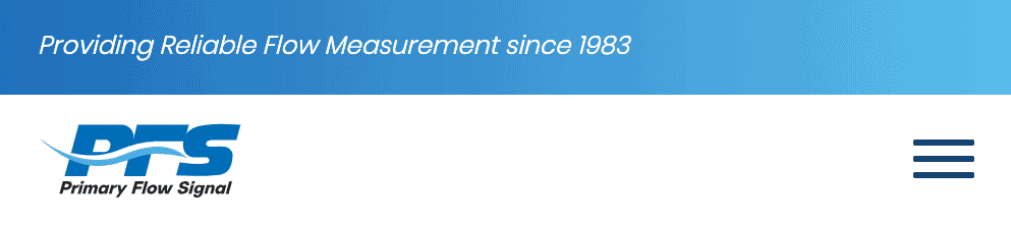
A lot of people don’t yet recognize this “hamburger” icon as a menu, and they will become frustrated. Users who understand what it is still must click on the icon to reveal the navigation, thus adding another step to retrieving your content.
Navigation tip: If you offer just a couple of products or services, you can use the product name or categories — Venturi Flow Meters and Flow Monitors, for instance — in the main navigation, instead of just “Products.” This gives visitors quicker orientation to what you offer.
Homepage wireframe recommendations for a B2B industrial website
Below are several wireframe guidelines we follow to maximize visitor engagement for your website’s most important page. The type of language you include in your homepage hero area and the pattern of information farther down the page make a difference in helping the page do its job.
Wireframe Example
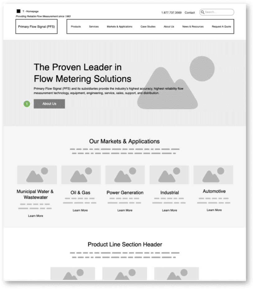
The wireframe example above shows how you can use the homepage to highlight a “CliffsNotes” version of your offerings. The homepage should deliver your company’s executive summary and provide a collection of headlines and snippets that provide quick bursts of skimmable information and shortcuts into deeper content. (We call it “skim and dive.”)
Be clear, to help your visitors quickly decide whether they’re in the right place or not. And if they are in the right place, and seeking what you offer, make it easy for them to contact you!
If they’re not ready to talk to sales yet, creatively present content that helps them answer the question, “Will this company help me solve my problem or achieve my goal?” and gives them a path to stay engaged with your brand. Through content strategy and the website user experience, you’ll nudge them to contact sales or make a soft conversion when they are ready.
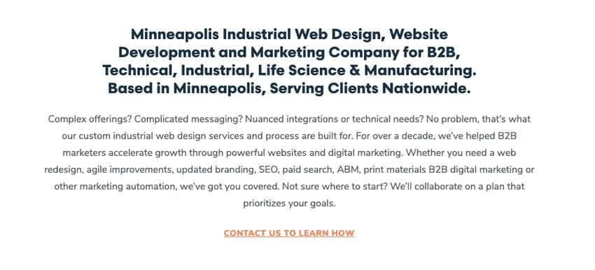
Homepage hero: your positioning statement and reassurance statement
Every website needs a strong positioning statement below the navigation and “above the fold.” Always express this message as simply as possible. For instance, you can structure your positioning statement as: “We do _____ for ______,” followed by a reassurance statement, which provides more detail and a CTA.
Although the words should take center stage, this area of your homepage should also feature an illustration or photograph that reflects how you help your prospects and generates trust. For more help in defining your positioning statement, read Industrial Website Design Strategy — Articulate Who You Are With Positioning and SEO
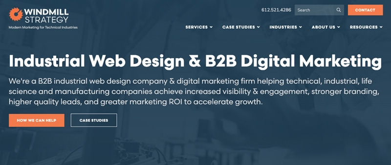
As an example, here’s how we present Windmill Strategy as an industrial web design & B2B digital marketing company on our homepage hero:
- Tagline — “Modern Marketing for Technical Industries,”
- Positioning statement — “Industrial Web Design & B2B Digital Marketing”
- Reassurance statement — “We’re a B2B industrial web design company & digital marketing firm helping technical, industrial, life science and manufacturing companies achieve increased visibility & engagement, stronger branding, higher quality leads, and greater marketing ROI to accelerate growth.”
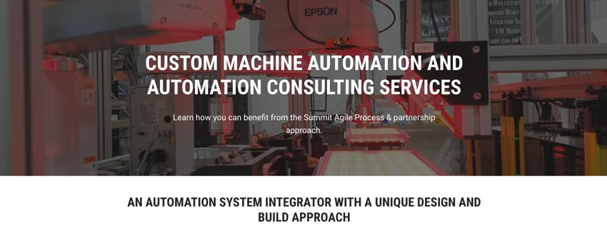
Additional homepage hero examples:
What comes after the “hero”?
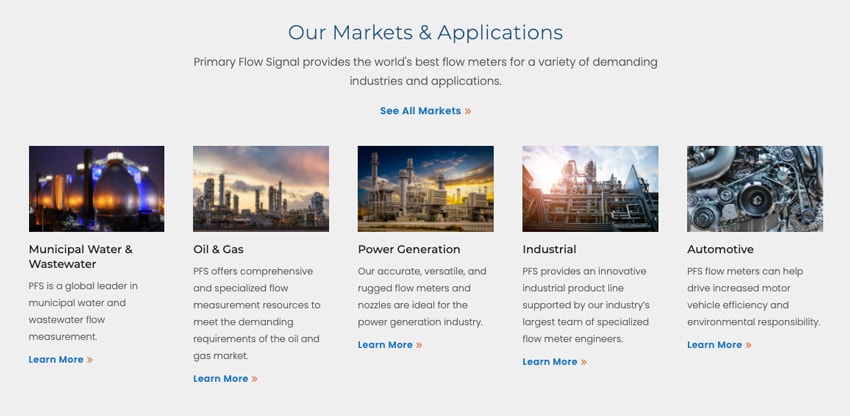
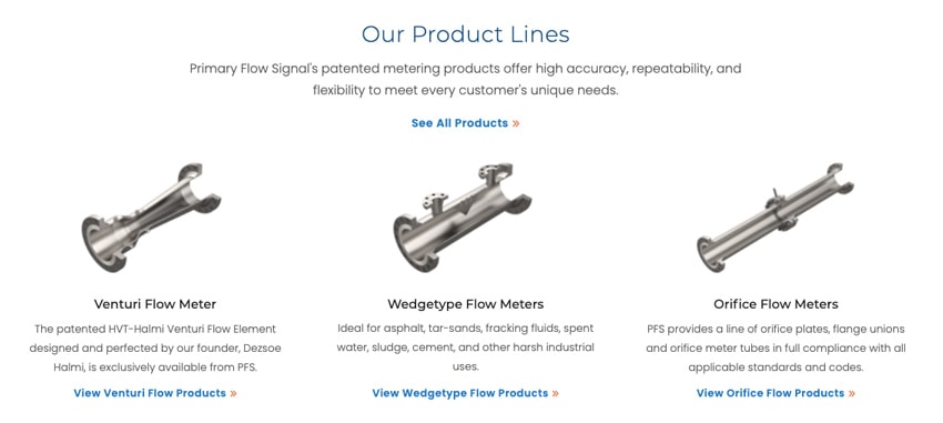
Don’t oversize the hero area to take up the entire screen. Leave enough room for the viewer to see at least a hint of what’s next on the page. The next portion should contain overview information that continues to educate around how you can help, including specific products and service offerings, and what markets you serve. The specific categories will vary based on your company and your prospects’ needs. These could include groupings like:
- Products and services
- Product applications
- Industries or personas (e.g., patients, physicians, hospital administrators)
You can include differentiating bullet points in this area, if you like, but keep them very brief. Focus on the most important information that helps visitors answer the question “(How)can this company help me?” in more detail. Present this information in text that is meaningful, short and skimmable, and include links to more detailed content. In B2B websites that we design, we often utilize an element called “cards” for this type of content, as shown below to help with website user experience.
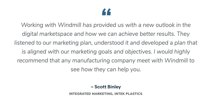
Show social trust
Social trust, in the form of testimonials and case studies, is invaluable because of the content’s objectivity. The homepage can include short testimonial quotes from customers, logos of your key client companies and links to detailed case studies.

Additional homepage content
To demonstrate your company’s authority and show empathy for your customers, we recommend including an additional paragraph or two below the fold. The heading of this content can be a great place for SEO keywords. Include just a few sentences that show you understand the challenges that your best customers and prospects are facing, you speak the same language, and you’ve worked with people like them before. Here’s how this content looks on our website:
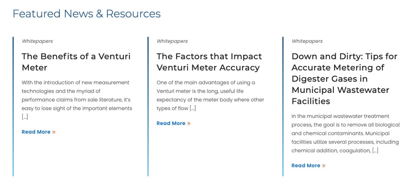
Share thought leadership and resources
Thought leadership content, in the form of resource articles, white papers or videos, can also be presented on the homepage, toward the bottom. These elements tie in to your long-term B2B content strategy.
In addition to having SEO value, good thought leadership content should be rich content that educates and informs your audience while building credibility. It shows people what you believe and what you’re an expert in, and it gives them a chance to get “inside your head” before talking to sales. When you do this well, you can gain a following among your best prospects well ahead of when they have a need for your services—and you’ll be the first they’ll call when they’re ready to buy.
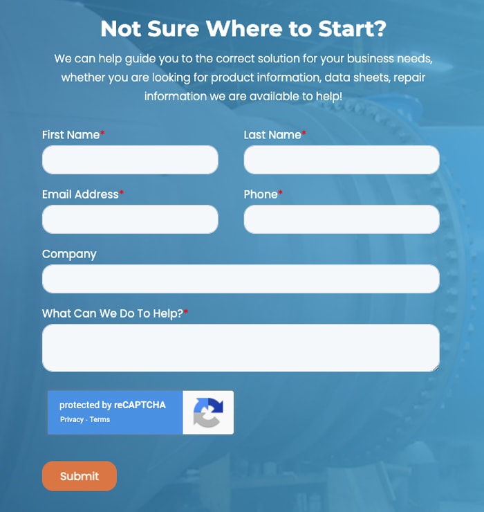
Display prominent calls to action (CTAs)
Always include prominent calls to action throughout your website’s user experience. If the page is long, consider including a compelling CTA with a form midway through the page, as well as at the bottom. (See the example below.) Many visitors won’t scroll all the way down a long page.
The page should conclude with footer navigation, which displays the company logo/brand name, links to important areas of your website and obligatory content items like links to your privacy policy, accessibility policy and copyright information. It’s recommended that you include an MQL conversion point at the bottom of the page as well, either as a “subscribe” link in your footer or a promotion for a whitepaper download or webinar series. If you don’t include these on the content of the page itself, they can also be displayed as a pop-in “lead flow” promotion or an exit intent (a promotion that shows when a visitor is leaving the page).
From top to bottom, your homepage is an opportunity to position your company in the minds of your prospects and provide a clear, simple path to the information they seek.
Looking for a deeper understanding of when, why and how to redesign your B2B website? Check out a webinar, or learn more about our upcoming on-demand virtual course, B2B Website Strategy for Lead Generation.