
A Logo Refresh May Sometimes Fit B2B Companies Better Than a Logo Redesign

Your logo is important. In fact, it’s the single most important graphic for your brand.
Although many of your clients are technical people who would say they care more about information, facts, specifications and form factors than branding, your brand always makes an impression on people, and you want it to be a positive one.
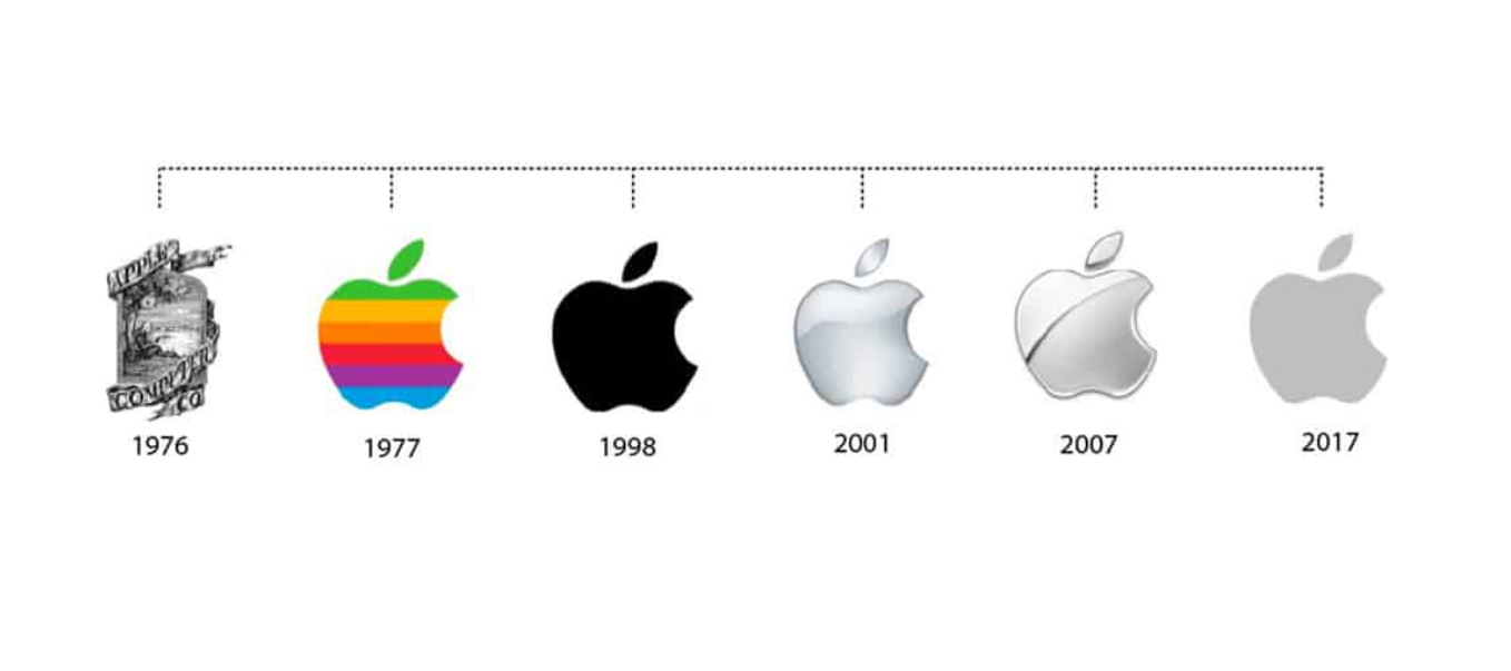
Apple realized the power of their logo early on, and that’s why they’ve given it so much thought over the years. But since their change from the Isaac Newton logo in 1976 they’ve never wholly redesigned their logo.
Instead, Apple has gone through many logo refreshes over the years keeping their logo very much the same and has only updated the color and style. After it adopted the apple-shaped logo everyone knows today, completely redesigning it would have actually hurt their branding efforts as the logo became synonymous with the company.
So what did Apple do instead? They periodically refreshed their logo. This kept the brand modern and helped the company use its logo effectively in new lines of business. Did this strategy work? Most definitely.
What can a B2B business learn from a B2C company like Apple?
The B2B Company’s Logo Conundrum
Logos are often designed quickly during a company’s early days. This was important to help the company get off the ground, but the logo may not hold up well over time. Because design trends change, a logo that initially looked great, or was cutting edge in the 1950s eventually becomes outdated. Or, as is often the case, that original logo was put together quickly in the startup phase, and the company outgrows it, needing something higher quality that better reflects their more established place in the marketplace.
Yet, getting a brand new logo can mean significant costs, as well as logistical challenges. You’ve probably invested a lot in marketing materials, signage, websites, and more. You might have a fleet of branded trucks or heavy equipment bearing your logo. Updating all of these materials to match a new logo will cost a significant amount of time and money.
You need an update, but do you need an entirely new logo? What factors should you consider when making your decision?
Deciding Between a Logo Redesign and a Refresh
When determining if a refresh or redesign is the best option for your company, you should ask yourself or your team a few questions.
- How much have you invested in your existing logo?
- Are your brand and logo well-known with target clients and prospects?
- What logistical challenges would get in the way of a large-scale redesign?
- Does your logo represent the current state of your brand?
- Does your logo represent where you want your company to be in the future?
The first three questions should have a follow-up. You should also consider how significant your investment has been to the success of your company. If your brand has achieved recognition after investing heavily in your branding and you suddenly change it dramatically, then you could be wasting a ton of resources. Don’t let your desire for a new logo cause you to make bad business decisions.
After you’ve considered your investment and logistics, it’s time to analyze whether or not your logo still represents what you do. For example, a company that started selling beepers in the 90s and later shifted to cell phones might include a very literal representation of the technology in its logo. In this case, it probably needs a complete logo redesign. Companies evolve, and if your evolution has completely changed what your business offers, a redesign may be the right option for you.
In contrast, many companies stay the course and provide a similar service for years. Maybe the offering has evolved, but the logo art was created more abstractly, lengthening its relevance. When you have a brand that has solid recognition or a logo that still represents your company well, a logo refresh can keep it relevant and future-proof it from changing styles.
The Benefits of a Brand Refresh for Technical, Industrial and Manufacturing Companies
“Design is the silent ambassador of your brand.” – Paul Rand
Is it really worth refreshing your logo? Yes. Your logo is often the first impression your brand makes and can either intrigue or underwhelm. Keeping your logo modern and relevant shows that you take branding seriously and convinces potential customers that you’re still relevant. Updating your quick fix logo from the start-up days or your legacy historical brand with a newer, higher quality version will increase trust and respect among prospects, who judge your organization’s quality based on the quality of your branding.
When you completely redesign your logo it’s possible that clients will no longer recognize you. This can be detrimental as this familiarity instills a certain amount of trust that motivates others to buy from you. A brand refresh gives you the best of both worlds. You get a logo with an updated look and feel while keeping brand continuity so that people familiar with your brand continue to recognize who you are.
Because the logo will not be completely different, a logo refresh often allows you to continue using your current marketing resources. This cost-effective solution is appealing to companies of all sizes with fixed marketing budgets.
Refreshing your logo:
- Capitalizes on your brand equity by not wasting your investment
- Eliminates the need to recreate all of your marketing materials immediately
- Ensures your brand is still easily recognizable
- Keeps your design modern and relevant
But, what does a logo refresh actually look like? Let’s look at some of the logos we’ve refreshed over the years and how our clients have benefited.
North Star Imaging
![]()
North Star Imaging’s logo is a great example of a minimal refresh. We modernized the fonts and increased the spacing to improve legibility and reproducibility of the logo. This cost-effective refresh did not require North Star Imaging to replace all products and signage immediately.
Rockler Woodshop Calculator
![]()
As you can see, a logo refresh doesn’t have to be extreme to be effective. For the Woodshop Calculator, we simply reversed the black contour to white and slightly adjusted the colors to help modernize the look and feel. We completed the transformation by updating the typeface.
CHORUS
![]()
While the changes to the CHORUS logo were subtle, they strategically retained brand recognition and allowed for future global expansion. We added a color coding system as a phased approach to international growth. The arrow and “US” in purple represent the United States branch, but when expanding to Europe, they can be swapped out with “EU” and a new color for easy differentiation.
SRF Consulting
![]()
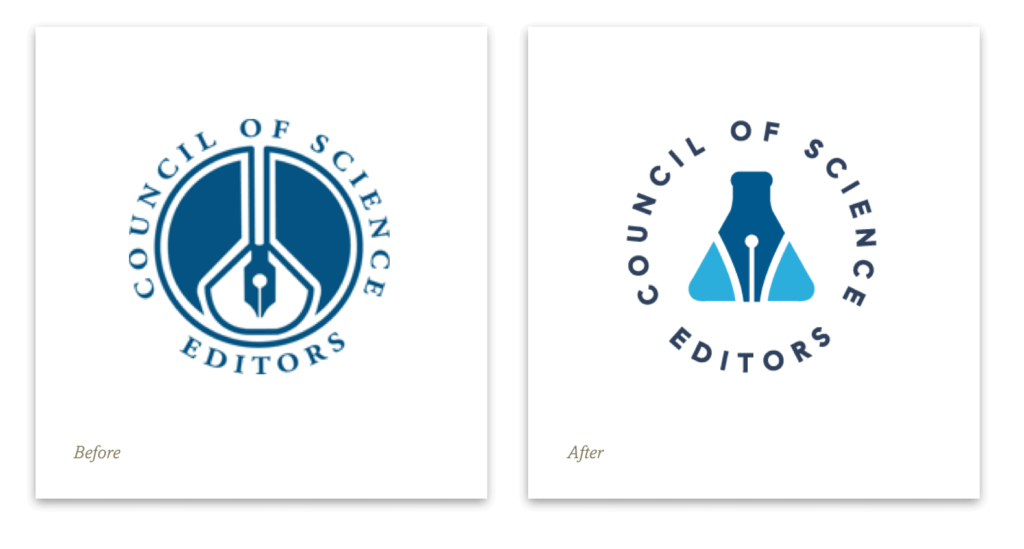
Council of Science Editors
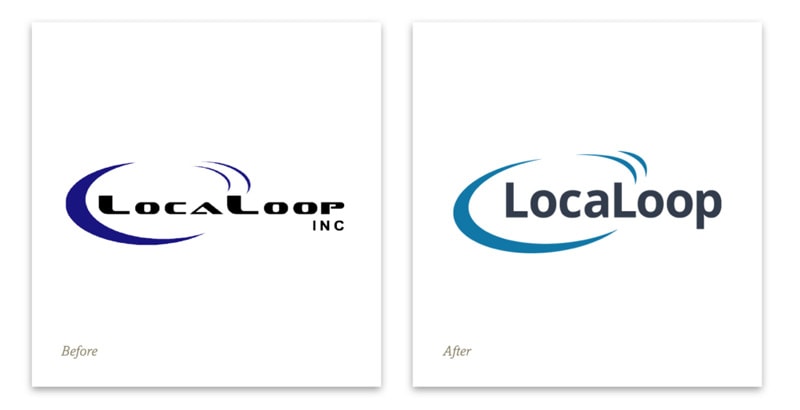
Localoop
White Oak Security
![]()
This last example shows an extremely minimal refresh that keeps the artwork entirely intact, but updates the type treatment for a modernized, more easily readable logo presentation.
Logo Redesigns or Logo Transformations
Sometimes when a logo is very outdated and there’s a business case for a complete transformation, a more dramatic change can be appropriate. Below are examples of recent logo redesigns Windmill has done for our clients, where the overall shape, arrangement and style of the logo has changed significantly, while keeping a small element (a directional arrow, a shape, or a key brand color). We still differentiate these examples from a full logo redesign, where a wider exploration of concepts is explored, however, these types of logo transformations would warrant a quicker rollout of the new branding, to avoid having too many competing versions of a logo in existence at one time. These types of transformations will of course also not be as immediately recognizable to long-time customers that you have brand recognition with, however, your customers will quickly adapt, and the new and improved logo will be more appealing to new customers and prospects.
Before and After Logo Examples
ETI and ACH
![]()
![]()
Electronic Technologies Inc (ETI) acquired American Cable Harness (ACH) and initially used the two original logos side by side on the ETI website. With the refresh, we updated both logos to use the same fonts and colors, in order to better complement each other and signify they were now part of one business.
Universal Network Solutions (UNS)
![]()
Universal Network Solutions felt their old logo was outdated and didn’t represent them as well anymore. They also wanted to make the change of going by Universal Network Solutions to just UNS. The client wanted a logo that was modern, and professional and would appeal to new clients and hires.
Modernize Your Brand With Minimal Effort
Windmill Strategy helps technology, industrial and manufacturing companies update their brands, improve their marketing, and create modern websites. If you want help bringing your logo up to date without sacrificing your brand and everything you’ve worked so hard to build, we can help.
Do you want to talk about which design option is best for your company’s future?