
Image Optimization Guide – Web Design Best Practices
What is image optimization?
Optimizing images on your website is the process of presenting graphics in the right format, dimension, and resolution while keeping the smallest possible file size.
Why is image optimization important for SEO?
There’s a reason they say that a picture is worth a thousand words. If your website takes too long to load, your brand’s story never gets told. After all, higher bounce rates mean conversion loss and conversion loss means missed revenue.
One of the biggest hurdles for website load speeds are improperly optimized images. Knowing how to handle the imagery on your site will help improve those speeds, increase SEO rankings, and overall improve your site’s UX. If a prospective customer enjoys looking at and spending time on your site, they’re more likely to convert. Optimized images help them on their journey toward that conversion you’re seeking.
What can I do to optimize the images on my website?
- What is image optimization?
- Why is image optimization important for SEO?
- What can I do to optimize the images on my website?
- Choose the right file type
- Compress your images
- Use responsive images
- Create unique file names for each image
- Include SEO friendly alt tags
- Learn about and serve next-gen images when able
- Serve images through a CDN
- Lazy load your images
- Image optimization tools we like
- Summary and checklist for a faster website
Choose the right file type
Different file types have different functions, strengths, and weaknesses. Ideally, you should use JPEG for larger, complex images and PNG for simpler ones. PNGs are higher quality, but they also have larger file sizes. This means that if you only use PNGs, you’ll have a beautiful site, but it might not load as quickly as you’d like. JPEG gives you color and clarity with a smaller file size. There are a few other things to consider when determining which file format you’re going to use:
- PNG is the only file format that easily preserves background transparency. If this is a priority, keep that in mind when choosing a file type.
- If you’re using vectors for logos, icons, or line art, using SVGs is a good idea. They’re automatically scalable and Google indexes them the same way it does PNGs and JPEG so using them won’t impact your SEO rankings. Added bonus: they have smaller file sizes, which can improve load times.
- WebP is an excellent alternative to JPEG and PNG, but it requires a little more effort to use. Developed and shared by Google back in 2010, this file format offers high-quality images with relatively small file sizes. Since Google is the most widely utilized search engine, using a file format they developed can only help your rankings. One drawback is that it isn’t supported on all browsers, which means that you have to have back-ups in place to make sure people using unsupported browsers can still see your graphics. That aside, you can use WordPress plugins like Webp Express or ShortPixel to convert images into WebP. See below for server configurations.
Compress your images
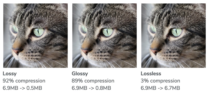
Image compression, put simply, is a process in which you fold an image’s data down to reduce the amount of time it takes to store or transmit that image. Long story short: compressed images load faster, and faster load times are always good for B2C and B2B websites. There are three different levels of compression:
- Lossy Compression – Lossy is the best option for most users. Images processed with Lossy algorithms are the smallest available optimized images. If the speed of your site is paramount and you want the best balance between optimization and picture quality, we recommend you stick with Lossy optimization.
- Glossy compression – Glossy is the best choice if you still care about Google Insights, but believe that a slight loss of page speed is an acceptable compromise for top notch image quality.
- Lossless compression – Lossless optimized images are pixel-by-pixel identical with the originals, but they offer a smaller size reduction compared to either Lossy or Glossy processed files. If you want your images to remain untouched, this is the option for you.
If you’re interested in image compression, there are a few key things you should know: save all images for the web, 72-150 DPI or use an image optimizer. We recommend using tools like ImageOptim or websites like ShortPixel, TinyPNG and JPEGmini before uploading to your website. For WordPress sites we recommend using ShortPixel or Smush. One more important thing to note: you can still reduce the file size of these images by removing their EXIF data. Most image optimization tools can do this for you, though you may need to configure settings.
Use responsive images
A responsive image is an image that automatically adjusts to fit the size of a screen. This adaptability will be crucial for any company that wants their website to be mobile device friendly. Since mobile devices account for more than half of all daily web traffic, this is a pretty essential feature to have.
Here’s some good news: if you’re using WordPress, your images are already responsive. This feature was added as a default in version 4.4. Images should have the srcset attribute, which makes it possible to serve a different image per screen width. Here’s an example of a responsive image tag:
<img src="really-cute-cat-200.jpg" sizes="50vw"
 srcset="really-cute-cat-100.jpg 100w, really-cute-cat-200.jpg 200w,
 really-cute-cat-400.jpg 400w, really-cute-cat-800.jpg 800w,
 really-cute-cat-1000.jpg 1000w, really-cute-cat-1400.jpg 1400w,
 really-cute-cat-1800.jpg 1800w" alt="really-cute-cat">
Create unique file names for each image
If you’re writing an article that’s all about really cute cats and you use an image showing a really cute cat, the file name shouldn’t be DSC2544.jpg. A proper file name would be really-cute-cat.jpg, making sure the main subject of the photo (and your article) is in the file name.
Unique, descriptive file names make organizing and finding images on your site easier. While this isn’t necessarily a benefit for the end user, it will make your life a lot easier. Less time wasted searching for mislabeled image files means more time that can be used for productive, revenue-driven efforts.
Include SEO friendly alt tags
The alt tag is a necessary addition to all HTML image tags. Google is smart, but it still needs your help with determining your website’s content value. Tagging your images assists their algorithms, boosts your ranking, and makes your images more likely to populate in image search queries.
Alt tags aren’t just for SEO purposes, either. They also provide valuable information for screen readers, helping disabled users to fully experience your web page’s content. Here’s an example:
<img src="really-cute-cat.jpg" alt="side-view-of-really-cute-cat">
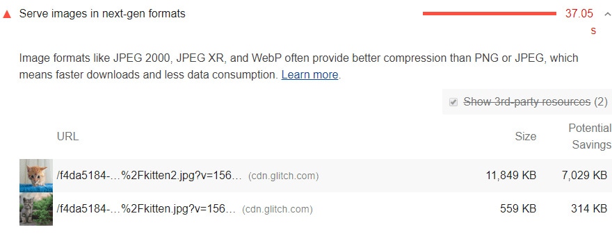
Learn about and serve next-gen images when able
The recommended next-generation image format is WebP. WebP was developed by Google and uses predictive coding for superior lossless and lossy compression online. It’s natively supported in Google Chrome, Firefox, Edge, and Opera. WebP images are typically 25-35% smaller in file size than JPEG and PNGs. This decreases page size and improves performance.
Other next-gen image formats include JPEG 200 and JPEG XR, though neither has widespread browser support.
As mentioned earlier in this post, you can use WordPress plugins like Webp Express or ShortPixel to convert your existing image into WebP. Then you will need to connect with your server’s support team to make sure there are rules in place to server WebP images with compatible browsers. Most modern browsers support WebP image format.
Serve images through a CDN
Image content delivery networks (CDNs) are excellent at optimizing images. In fact, they’re one of the most popular site speed optimizations available. Switching to an image CDN can yield a 40–80% savings in image file size. They also help to reduce bandwidth costs, improve security through DDOS mitigation, and can help you avoid traffic loss from hardware failure. Many host providers offer free CDNs, so check with your hosting solution to see what’s available.
The way CDNs work is pretty simple: they optimize your images and get them to your user as quickly as possible. The CDN will create new versions of images as they are needed, and serve your images from an offsite url with caching enabled that loads quickly, usually before the page can render. Running an image CDN can speed up image delivery speeds multiple times over.
Lazy load your images
Typically, when someone opens a webpage, the content of that entire page is immediately downloaded and rendered in one fell swoop. This makes caching pages easy, but it can also lead to slower load times and wasted bandwidth. That’s where lazy loading comes in.
Lazy loading below-the-fold images (especially larger ones) can provide significant performance improvements. The lazy loading technique allows the page to finish loading even though many off-screen images will only start loading once a visitor scrolls down the page. The only things that get loaded are the things the user is actually looking at, saving your memory and improving your site’s overall UX.
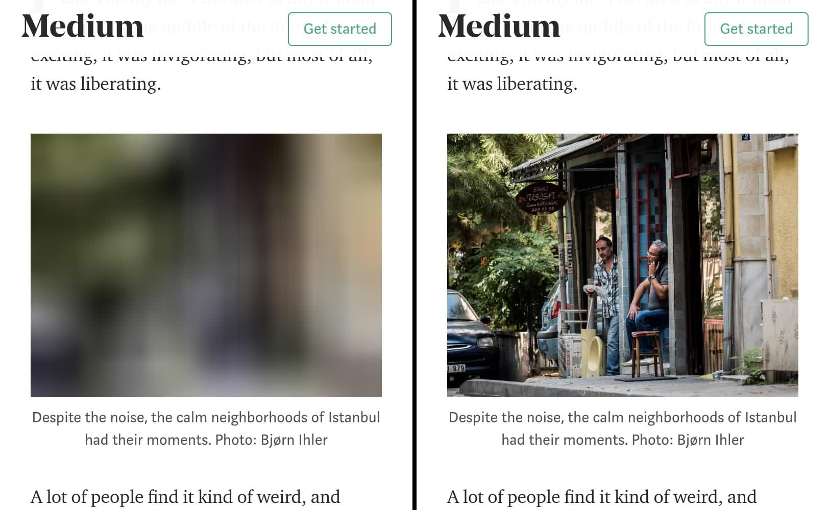
Image optimization tools we like
- Imageoptim (mac only app)
- ShortPixel (website)
- TinyPNG (website)
- JPEGmini (website)
- ShortPixel (WordPress plugin)
- WebP Express (WordPress plugin)
- Smush (WordPress plugin)
Summary and checklist for a faster website
Set up your website/server for success
- Add CDN to your website
- Serve next gen images
- Lazy load your images
Set up your website/images for success
- Choose right file type
- Compress images
- Use responsive images
- Custom file name
- Include SEO friendly alt tags
Optimizing the images on your website might seem like a big to-do in the beginning, but once the best practices are in place, you’ll be thankful for the increased traffic, conversions, and organic rankings. If you’re looking for help tackling a project like the organization and optimization of images on your website, get in touch with the team at Windmill Strategy.