
The Web Design “Fold”

Clients often ask us whether items in a web design need to fit “above the fold.” In order to answer that question, let’s first take a look at where the fold originated and some principles that need to be kept in mind when designing for the web.
So, What is the “Fold” Anyway?
The most common use of the “fold” comes from newspapers, and refers to the top half of the front page. The most important headlines are always included above the fold, and readers have to flip the paper over to read further.
In web design, the fold refers to the line at which the user must scroll to view additional content on the lower parts of the page. In the early days of web design, monitor size and resolution were very consistent. Because of that, websites were designed to fit within the fold. At that time, the concept of the fold was still applicable.
Is the Fold Still Relevant Today?
Yes and no. The death of the fold has been talked about since the release of smartphones. Since then people have been accessing websites through their phones, tablets, monitors, and televisions. Each of these devices has different operating systems, resolutions and browsers—not to mention that tablets allow the user to display a page in horizontal or portrait view.
The arrival of smartphones and tablets also changed the way people consume information and navigate the web. Smartphones taught users how to scroll and swipe with their fingers, and in doing so, reinvented the way websites are designed.
This is not to say that the fold doesn’t exist on webpages anymore—it certainly does still play a role in web design—but how we think of it has changed. Instead of cramming all content above the fold, as was previously done, designers should focus on using the space above the fold to share only their most important messages. This gives the page some visual breathing room and presence, allowing users to have a better experience overall. The design still needs to keep in mind page hierarchy, and be designed in a way to encourage user scrolling. Below are a few techniques to encourage scrolling:
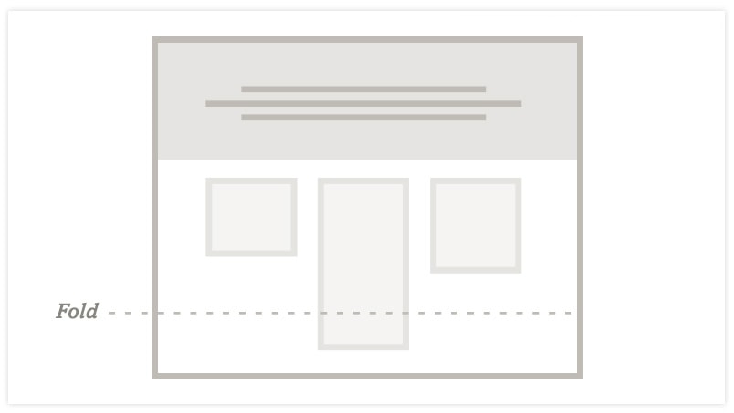
- Use a variation of content columns: By staggering different column lengths, we prevent bands of empty space across the bottom of the page that makes it seem like the page has ended. Having paragraphs or images continue beyond the fold line indicates that more content exists on the page and encourages scrolling.

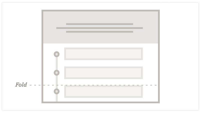
- Storytelling and page trails: Using a trail that leads the user down the page is a visual way to encourage a user to scroll. The trail is cut off at the fold, so in order to view more content, the user will need to scroll down the page.

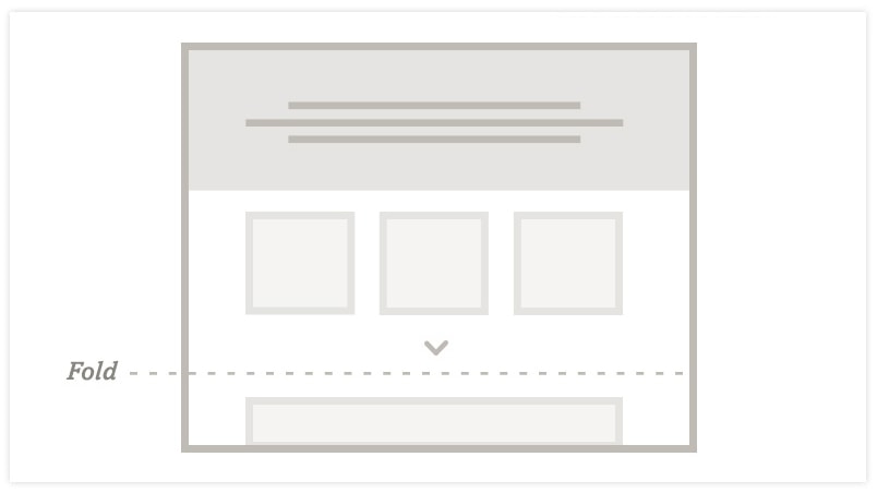
- Be straightforward: There is nothing wrong with telling the user to scroll; this can be done through text or a nicely designed graphic. The graphic can be locked into the bottom of the browser window and disappear when the user scrolls.

Ultimately, to make a great website experience for users, a website needs to be designed with visual cues and compelling content in mind that encourages users to keep scrolling.
Contact us to learn more about creating a custom website for your business