
Landing the Page: 5 Examples of Successful B2B Landing Pages

When it comes to successfully crafted B2B landing pages, there’s always more going on that meets the eye. There’s organization, guidance, design, and intent behind every choice that’s made. After all, they’re called “landing pages” for a reason.
It’s the place a prospect “lands” after being directed by a link in a social post, blog post, paid ad, or similar piece of digital marketing media. A landing page is crafted with a singular purpose, and that purpose is usually to get a prospect to do something.
How a business gets that prospect to do that “something” depends on how well their landing pages are designed. We’ve recently talked about how to craft the best landing pages for your business, but that was only the beginning.
Today we’ve brought together five of our favorite B2B business landing pages so you can see real life examples of our suggestions in action.
Shopify
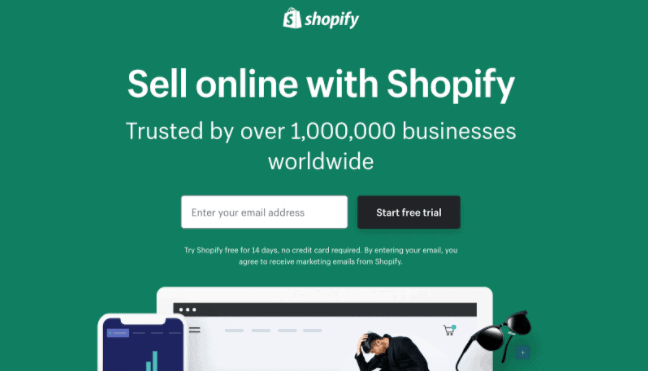
Why this is a good example: it makes conversion as easy as possible.
The whole goal of any landing page is to inspire prospects to do something. Shopify’s free trial landing page does exactly that by showcasing a simple email form front and center on the page. By not asking for too much from an initial interaction, they warm up prospects and get crucial information from them in one fell swoop.
Webflow
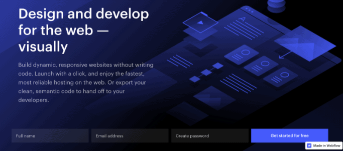
Why this is a good example: no scrolling necessary.
If you didn’t know what Webflow offered before seeing the screenshot above, now you do. Which is why we consider this to be an especially successful landing page. They’re able to quickly and concisely let you know what they’re offering and give you an opportunity to try it – without you even having to scroll!
Unbounce
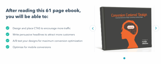
Why this is a good example: focus on benefits, not features.
It’s not surprising that a landing page for an ebook about successful landing pages would be on this list. If Unbounce couldn’t get you to convert with this page, then they’re proving that their tactics don’t work. If they do get you to, then you’re guaranteed to receive a helpful guide. That’s undeniably clever. Our favorite part about this landing page is their focus on copy that lists immediate benefits to anyone who downloads.
Slack
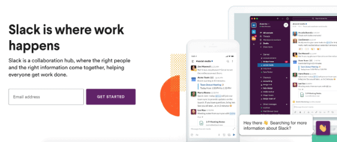
Why this is a good example: using as many best practices as possible.
This landing page from Slack is on the list because it checks all the best landing page practices boxes. They offer a headline that’s succinct and clever, their design is bold but not distracting, and it artfully employs a hero image. All of this occurs without any scrolling being necessary. If you do scroll, they add a quick benefit list alongside logos from existing big-name customers, borrowing their inherent klout.
DocuSign
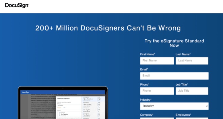
Why this is a good example: smart use of numbers to elicit an emotional response.
This page from DocuSign is smart in a number of ways. They’re following the best practices of balancing simplicity and boldness and removing existing navigation. What sets this page apart is their tactical use of data. There’s a foundation of trust that’s immediately built when you learn that they have over 200 million existing users, making a prospect more likely to convert.
B2B marketing relies on emotional responses just the same as B2C marketing. The difference is that you need to back up that emotional response with the benefits and logic that can lead to sound business conversions. That’s something all the examples listed above were able to do successfully.