
How Do Infographics Strengthen Communication?

As the saying goes, “a picture is worth a thousand words.” So how many words should an infographic be worth?
Infographics, at one level, are a way of taking something very complex and distilling it down to a visual that is quicker and easier to comprehend.
At another level, infographics can expand upon a simple message and convey authenticity or complexity. An informative graphic can also be an opportunity to “wow” your audience around the complexity that actually goes into the service that you provide.
Don’t ever use infographics in place of straightforward product data that technical clients are seeking, but there are plenty of cases where “show me” is more clear and impactful than “tell me.”
Used well, an effective infographic is stimulating and satisfying. It shows that your company can handle important data with confidence and creativity. As a result, it strengthens your ability to communicate with customers.
What Makes a Picture So Effective?
While visual aids can be an impressive tool for business, they also have a solid basis in science.
Vision researchers discovered that a large part of the brain is dedicated to processing visual information. Visual processing takes up about 30 percent of neurons in the cortex. To put that in perspective, eight percent of neurons are for touch and three percent is for hearing. With so much of our brain working on visual input, it’s not surprising that humans have a bias for visual thinking.
In your day-to-day life, you can find evidence for this bias. After reading a book, you’re more likely to remember mental landscapes or visual scenes. The individual words or paragraphs fade away.
Or think about signs in public spaces. They use pictures, symbols, and colors, rather than words. For example, traffic lights direct billions of people using three simple colors.
Additionally, neuroscientists from MIT found that the brain can process images in 13 milliseconds. That’s 0.013 of a second. This amazing biological feat implies that humans are hard-wired for quick visual stimuli. It could be an evolutionary trait that humans developed to sense danger, find food or a suitable mate. Or it could be that we just really like pictures. Either way, it’s a very effective tool for communication.
Pictures Are More Effective and Approachable
There’s evidence that pictures last longer in the brain than other forms of information. There’s even a name for it, the picture superiority effect. This is the effect that causes visual memories to last longer than stimuli from other senses.
As well as being long-lasting, an infographic can be approachable and inviting. Visuals process faster than text and require less commitment from the reader. Rather than feeling lectured to, the reader can glance at an infographic, make a judgment, and get on with their day.
The reader could even return to the infographic, between stretches of reading. Eye tracking studies show that readers spend more time looking at important pictures, rather than text. So if your content has well-designed and relevant graphics, readers will spend more time on your content. And that means more time spent on your brand message.
Moreover, the longer readers spend on your page, the higher your page is going to rank on search engines. Since the mass of content online is ever growing, it’s essential to make sure readers are finding, absorbing, and sharing your content.
When Should I Use an Infographic?
While infographics are appealing, not every situation calls for a graphic. Should a pie chart or spreadsheet go with every sentence? No, it would interrupt the effective flow of information.
Many companies mistakenly believe that any picture will do, as long as it’s bright and colorful. However, as in any form of storytelling, visual stories need a solid base to be effective. To make sure your infographic works, ask yourself some questions:
Is it pertinent? The visual content must be relevant, useful, or illustrative. The eye-tracking study found that readers filter useless images that do not enhance meaning. An infographic should not be used to jazz up dreary writing. If you removed the infographic, how would the message change?
Is it decipherable? While your graphic designer might enjoy making a multi-layered and complex graphic, it might not be fit-for-purpose. Often something simple is better. Aesthetic beauty should serve the message, not vice versa. Should the tone be hand drawn and approachable? Or is your audience more technology-minded and therefore need animated or interactive elements?
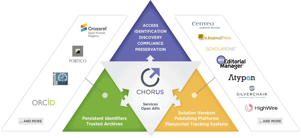
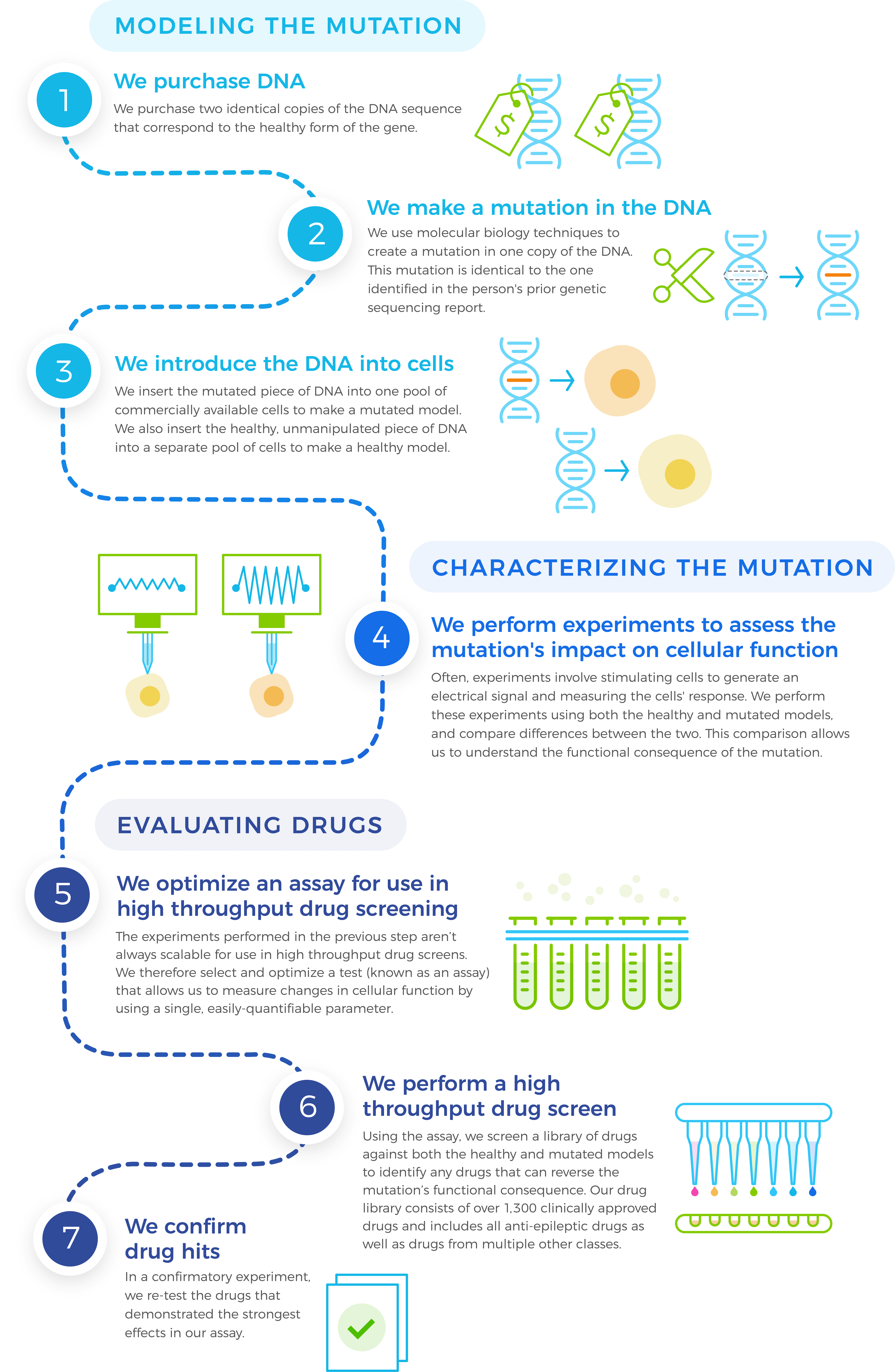
Infographic Examples
What Is the Best Infographic for You?
Knowing your audience will inform much of the infographic’s design. For example, if you are seeking a younger buyer they might appreciate modern, more complex and interactive design. An older, more traditional client might prefer something simpler and easy to read. Engineers tend to prefer facts and straightforward information, conveyed simply and with impact, without a lot of marketing “fluff.” The more you know about your audience, the more specific a designer can be when illustrating your message.
Remember that for any audience, well-made infographics enhance communication. The best infographic provides an instant biological impulse and conveys meaning at a glance. It should also look pleasing upon return glances and reveal deeper layers of meaning.
An infographic can form an integral part of your brand communications. They can display your company’s creativity and confidence. Through close consultation, Windmill Strategy can custom design the right visual message.
Do you need an infographic that resonates with your audience? Contact us today