
The Power of Infographics in B2B Marketing Communication


As the saying goes, “a picture is worth a thousand words.” So, how many words should an infographic be worth?
Infographics allow complex information or processes to be simplified into visuals that are easier and quicker to understand. They can also help add depth and contextualize a simpler message, showing your expertise and giving your audience a better sense of the work behind what you do.
While they shouldn’t ever replace straightforward product data that technical information buyers need, infographics are the perfect way to “show” rather than “tell.” When done well, they make your company look confident, creative, and capable of communicating important information clearly.
- What is an Infographic?
- Why are Infographics so Effective in B2B Marketing?
- When Should I Use an Infographic?
- Are Infographics Good for SEO?
- How to Create Compelling Custom Illustrations and Marketing Infographics for B2B
- Examples of B2B Custom Illustrations and Infographics
- What Is the Best Infographic Type for You?
What is an Infographic?
An infographic is a visual way to present information, data, or knowledge that is easier to understand at a glance. It combines graphics, icons, charts, and bits of text to explain something that might otherwise take several paragraphs to describe.
Unlike an illustration, an infographic goes beyond simply showing what something looks like. It’s designed to communicate information, tell a story, or simplify a complex concept through a mix of visuals and text.
In B2B marketing, infographics can be especially powerful. Many products and processes are complex, whether it’s explaining how something works, how it’s made, or how it performs. A well-designed infographic makes those ideas easier to understand and more likely to be remembered. Your website users can quickly grasp the idea and see the value behind what you do.
What is the purpose of an infographic?
In B2B marketing, especially for technical, industrial, or engineering-focused audiences, infographics serve a purpose that goes well beyond decoration. Their primary goal is to convey complex information quickly, clearly, and visually, making it easier for the viewer to grasp key concepts without reading through dense paragraphs of text.
Infographics are information-first visuals. They are designed to educate and inform, helping users process multi-step processes, technical workflows, or layered concepts at a glance.
Effective B2B marketing infographics:
- Break down complex technical processes into clear visual steps.
- Showcase data or research findings in a digestible, engaging format.
- Summarize case study results with callout metrics and outcomes.
- Compare solutions or product features side by side.
- Provide quick-reference visual guides for engineers, specifiers, or decision-makers.
Why are Infographics so Effective in B2B Marketing?
People absorb information in different ways, and today’s audiences have shorter attention spans than ever. Most of us scan content instead of reading every word. Adding custom illustrations or infographics helps engage all types of website users, those who prefer quick takeaways and those who want a deep understanding. Visuals create a stronger, longer-lasting impression than text.
As well as being long-lasting, an infographic can be approachable and inviting. Visuals process faster than text and require less commitment from the reader. Rather than feeling lectured to, the reader can glance at an infographic, make a judgment, and get on with their day.
Eye tracking studies show that readers spend more time looking at important pictures, rather than text. So if your content has well-designed and relevant graphics, readers will spend more time on your content. And that means more time spent on your brand message.
A picture is sometimes worth a thousand words. Engineers and technical buyers want the specs and the information at their fingertips, and having it diagrammed out can only help them to understand it more quickly — and generate trust and interest in your product or process.
C-suite and management-level audiences appreciate process overviews that demonstrate a proven process that they can understand quickly, without needing to pore through numerous paragraphs of text content.
When Should I Use an Infographic?
While infographics are appealing, not every situation calls for a graphic. Should a pie chart or spreadsheet go with every sentence? No, it would interrupt the effective flow of information.
Many companies mistakenly believe that any picture will do, as long as it’s bright and colorful. However, as in any form of storytelling, visual stories need a solid base to be effective. Before using an infographic, ask yourself:
- Is it relevant?
The graphic must be relevant and enhance the message. Avoid adding visuals just for flair; remove the infographic and ask: Does the message still hold up or does it lose meaning? - Does it make sense?
The graphic should communicate the message clearly. Consider: Is simplicity prioritized over aesthetic complexity? Would a hand-drawn style or a tech-driven, animated look better suit your audience?
Are Infographics Good for SEO?
Good news. Illustrations and infographics are not just compelling and attractive – they’re also good for SEO.
The longer a user stays on your website looking at interesting information, the better you’ll rank in search engines, leading to more traffic and potentially more conversions. Using keyword research and keyword focus for the page, once your infographic or illustration is finalized, you’ll want to optimize it to include keywords in the filename, alt text, and any supporting text or captions.
Best SEO practices for infographics:
- Use keyword-rich filenames.
Instead of a generic name like Image001.png, use something like custom-rubber-molding-process.png. - Write descriptive alt text.
This improves accessibility and SEO. Example: “Infographic explaining custom rubber molding process.” - Choose the right file type and size.
Use JPG at the lowest acceptable quality for speed. If PNG is necessary, compress it using tools like TinyPNG to reduce file size and not slow down your site.
How to Create Compelling Custom Illustrations and Marketing Infographics for B2B
Technical illustrations and process infographics for B2B and technical industries need to be more than fluff – as does all of your marketing. This means that the process can’t start by setting a designer loose to create something that just looks nice, of course.
- Start with a Documented Process
If the process that you want to convey has a clearly defined process written out in text form, that’s the best place to start. If you don’t have that yet, now’s the time to write down some bullet points and begin the EOS marketing and operations process of having all of your core processes documented and followed by all. - Choose the Right Visual Structure
There may be multiple ways to convey the subject matter. Consider:
• Linear flowcharts for step-by-step tasks
• Loops or flywheels for ongoing processes
• Exploded views or diagrams for system overviews
Start with a simple wireframe that focuses on clarity, not polish. This “rough draft” helps identify the best structure before investing in design. - Consider the Intended Audience’s Perspective
There may also be multiple points of view to consider — internally, B2B companies tend to think of a process in terms of its own operations, milestones and deliverables, but it’s useful to frame the process from your audience’s point of view, not just your internal workflow. Ask:
• What does the customer need to know at each step?
• What outcomes or benefits matter most?
Test the wireframe with internal stakeholders or a sample audience to validate understanding. - Finalize Design and Deploy
Now comes the fun part, when things start to come to life. Once the structure is approved:
• Select design styles, icons, and typography aligned with your brand
• Create the high-fidelity infographic
• Use the final graphic across web, print, sales materials, training, and social media
• Keep editable files for future updates as your process evolves
Examples of B2B Custom Illustrations and Infographics
Below are a few examples of illustrations and visual marketing infographics that we’ve created for our B2B clients to convey complex ideas or processes:
#1 Medical Illustrations for a Medical Device Company:
In this example, a medical illustrator on our team created drawings that focus detail on the medical device and its benefit to surgeons, eliminating extraneous detail to focus on what’s most important. The first device allows surgeons to perform a procedure with less back pain; the second reduces harmful radiation during procedures.

#2 Custom Illustrations for Technology Company:
With rural communications providers as their target market, LocaLoop required a website focused on the benefits of cloud-driven 4G in a box. We created an engaging, interactive homepage animation to help illustrate the business model while enhancing homepage interest.

#3 Custom Illustrations for Complex B2B Services:
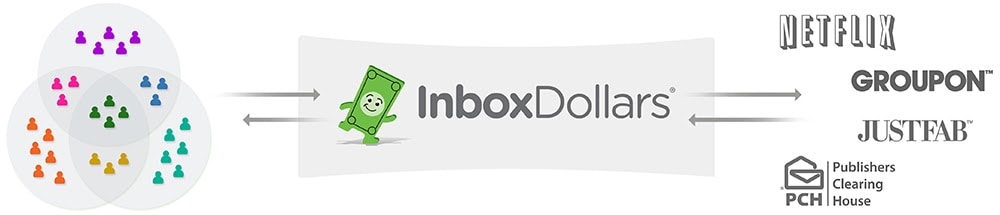
When InboxDollars decided to redesign its corporate website, custom illustrations were important in communicating its complex business model. We created a custom animation for their homepage that, in a matter of seconds, explains what their core brand does—connecting targeted members to brands.
#4 Technical Illustrations for Industrial Manufacturing Company:
This type of illustration or diagram is necessary for technical products, highlighting the specifications most important to an engineer or technician and showing the most critical functions.

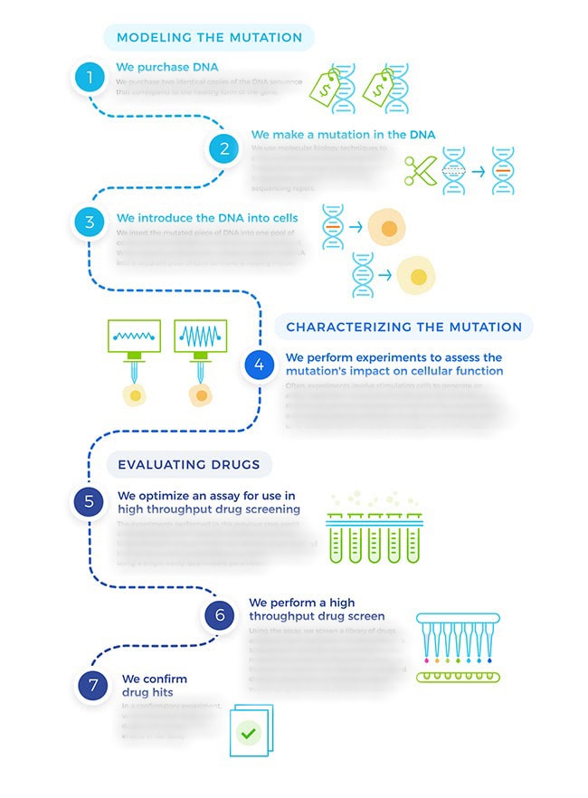
#5 Process Infographic for Life Science Company:
#6 Custom Illustrations for Technology Company:
An IT company was in the process of a brand refresh when they asked for our help creating custom illustrations to communicate their process and services in a simple way for potential clients to understand. We worked closely with them to understand what needed to be communicated and made recommendations on how to simplify those messages and overall visual marketing communication. The new look and feel direction for the illustrations features a hand-drawn effect, reflecting the company’s personable approach to IT.

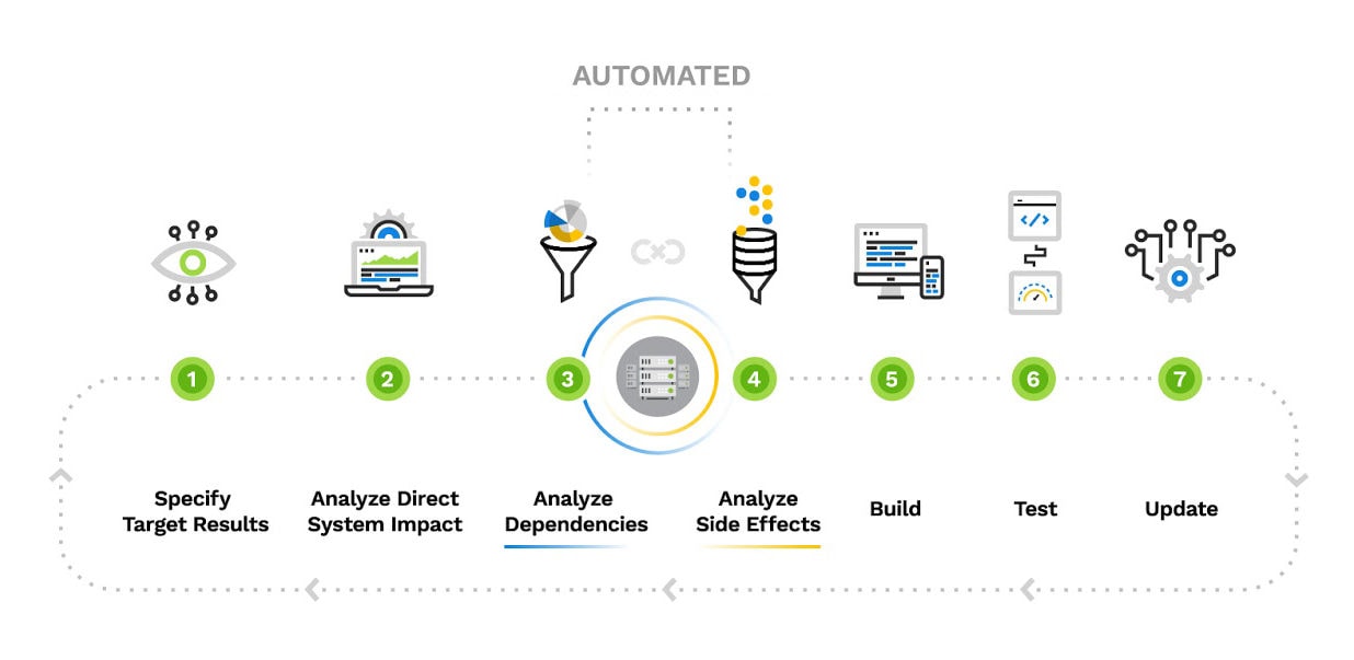
#7 Infographic for Industrial Automation Company:
Here’s another example of a process diagram, utilizing custom graphics and icons to help illustrate what happens in each phase.
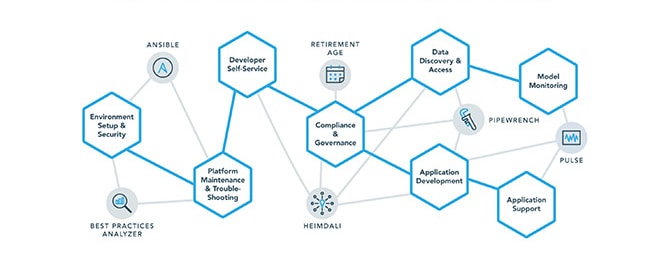
#8 Animations and Custom Illustrations for a Big Data Company:
Big data and other technical industries have complex processes and workflows. This can make marketing communication complex. Sometimes process diagrams become less linear and show a web of processes, as in this diagram for a big data organization.
#9 Process Infographic for B2B Technology Company:
This process infographic example for a technology company highlights the part of the process that their solution automates, and shows the recurring cycle of steps.
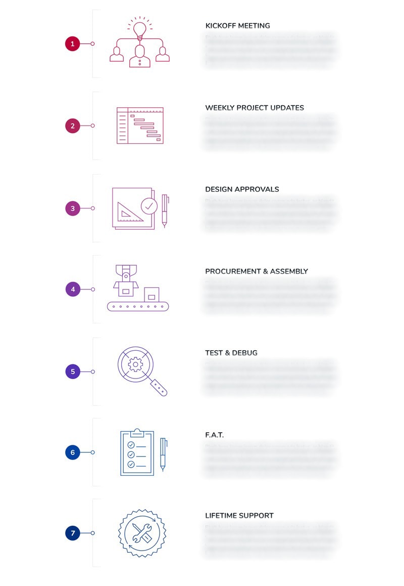
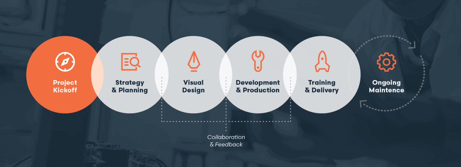
#10 Process Diagram for Windmill Strategy’s B2B Website Process:
And finally, here’s a simple process diagram of our website design and development process. It shows how we start with a collaborative kickoff with all major stakeholders, discussing overall goals, market positioning, competition, personas/Ideal customer profile, target keyword identification, what’s working and not working, and metrics for success. This is followed by strategy and planning, which consists of content strategy, sitemap, wireframes, keyword research, and other technical specifications. Visual design, development, training, launch, and ongoing maintenance follow. This type of visual marketing infographic is a great tool for a sales presentation — it doesn’t list all of the details, so it can’t stand alone, but it helps frame what the speaker is saying as a cohesive process. It has proven to be extremely effective towards our marketing communication goals.
What Is the Best Infographic Type for You?
Knowing your audience will inform much of the infographic’s design. For example, if you are seeking a younger buyer they might appreciate modern, more complex and interactive design. An older, more traditional client might prefer something simpler and easier to read. Engineers tend to prefer facts and straightforward information, conveyed simply and with impact, without a lot of marketing “fluff.” The more you know about your audience, the more specific a designer can be when illustrating your message.
Remember that for any audience, well-made infographics enhance communication. The best infographic provides an instant biological impulse and conveys meaning at a glance. It should also look pleasing upon return glances and reveal deeper layers of meaning.
An infographic can form an integral part of your brand communications. They can display your company’s creativity and confidence. Through close consultation, Windmill Strategy can custom-design the right visual message.
Do you need an infographic that resonates with your audience? Contact us today