
Five Tips for a High-Conversion CTA on Your Industrial B2B Website
Creating great calls to action on your industrial B2B website can help you get higher conversions. Although there is no clear-cut formula for creating the perfect CTA, there are best practices to follow.
Each B2B industrial website’s CTAs will vary depending on the exact audience, the nature of your products or services, and your content offering. Keeping your audience in mind should be the number one consideration when creating CTAs. Try to use language that they might use when they’re ready to take the next step. Revisit CTAs frequently to see what is working or not working, and update them accordingly.
We will look at the following five areas for optimizing CTAs:
CTA copy
The first item is something that often gets overlooked: the text for the call to action. The CTA should motivate and create a sense of urgency for the user to want to click through. It should also be more descriptive than ‘Learn More’ or ‘Contact Us.’ You will want to keep the text short and to the point, while accurately reflecting the offering. For example:
- DO: Download Now
- DON’T: Click here to download a free eBook
Button design
The design of the CTA should stand out from the rest of the page. We recommend using a button as the main call to action and text links for the secondary calls to action. The color of the CTA should contrast with the rest of the design to grab the user’s eye and pull it straight to the CTA. For example:

Placement and type
Now that you have a compelling call to action with a button that will not be missed, you also need to think about the placement and type of the CTA, two considerations that go hand in hand.
Different types of CTA’s include: buttons, text links, pop-ups and chat. Placement can be in the corner, at the bottom, or in the middle or even near the top of the page. Because you can’t guarantee that everyone will read the whole page, on longer content pages it makes sense to have a CTA in the middle of the page, or high enough on the page to be “above the fold.”
Here are some examples of CTA placements and types:
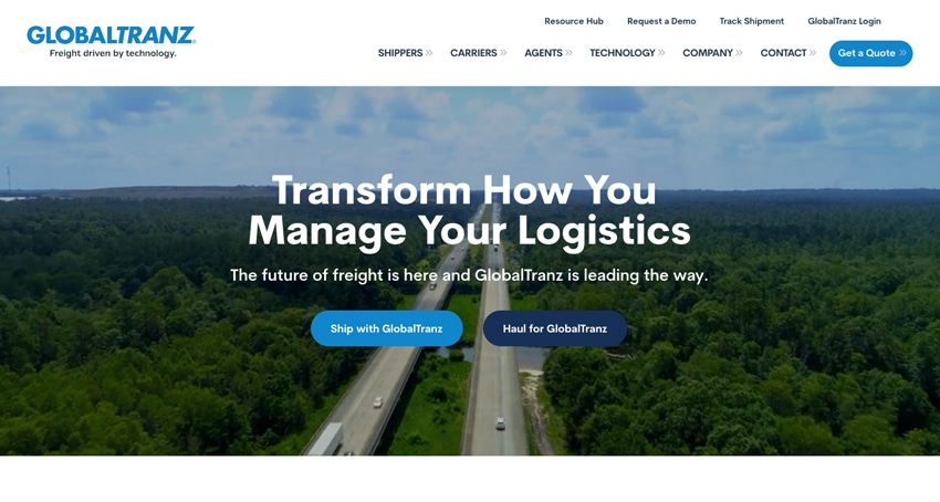
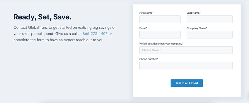
Above the fold – For the GlobalTranz website, there were two paths that the company wanted to make sure visitors saw when first landing on their website. “Ship with GlobalTranz” and “Haul for GlobalTranz” provide two distinct paths for the visitors to take.
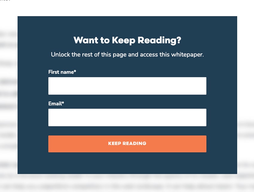
Pop-up for gated content – On our Windmill website, users can read the beginning of each whitepaper. If the user would like to continue reading, they provide their name and email, as prompted by a front-and-center pop-up CTA.
Pop-up in the corner of the site – A less-obtrusive CTA is a pop-up that appears in the bottom right corner of a browser, as shown below. These can be set to show up when a user has been browsing for a certain number of minutes or visits certain pages.

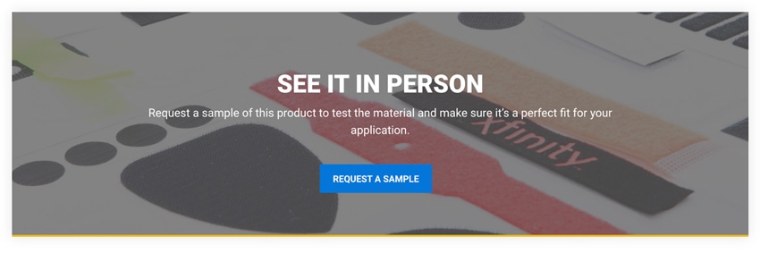
Inline or mid-page – Some industrial B2B website pages contain a lot of content. A call to action can be placed “inline” to break up a longer content page. This can also help the CTA feel more natural and conversational.
Overall CTA journey
As users go through your website, high-quality content and solid user experience, along with a compelling CTA, will get higher conversions. You want to guide the user and set their expectations; you want to think of their overall journey to get to the CTA—and what happens next. For example, if a user clicks on ‘Request a Quote,’ they should get to a form page that is specific to requesting quotes and not just be sent to the main ‘Contact Us’ page. This helps validate to the user that they are in the correct spot.
Think about the thank you page or email. Let the user know what to expect next, such as whether they will hear back in 24 hours or 2-3 days. You don’t want the thank-you page to be a dead end. What are some next steps or content that could be relevant, based on the information they provided? Would it make sense to lead them over to your blog/news?
Monitoring, testing and refinement
As you adjust the CTAs on your website, continue to monitor and refine them. One way to test CTAs to see what works best is to A/B test the text or button styles. A/B testing is a great way to learn more about your exact audience and what speaks to them. To get the clearest results, we recommend only A/B testing one item at a time.
After you find a winner, you will want to continue to monitor your CTA click-through rates and submissions. CTAs may need to be adjusted if the click-through rate starts to drop. Refining calls to action will help keep your industrial B2B website doing its job effectively.