
What’s the Best Strategy for Your Website Navigation Bar?

Good website navigation is one of the most crucial parts of your website strategy.
With all the pages on your website, it can be daunting to determine which are the most important and should live in the navigation bar. However, with careful planning and organization, your website’s navigation can positively impact user experience, site traffic, and eventually, conversions.
Types of website navigation
There are many types of website navigation. Here are some of the most common styles:
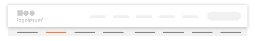
The Horizontal Navigation Bar
This is the most recognizable, classic type of website navigation. It’s global (located on every page) across the website. It provides quick links to top-level pages, or the most important pages, and can also include crucial elements such as the search bar, CTAs (calls to action), and your logo.
The Utility Navigation
Links in the utility navigation are, as the name suggests, utilitarian links. They can include activities like search, login, subscribe or contact us. Typically, utility navigation exists above the horizontal navigation, with weight to the upper right corner.
The Footer Navigation
Many items in the footer navigation repeat from the main horizontal navigation or utility navigation, but users will often go directly to the footer to find things like contact information, location, careers, or customer support. It’s also a great place to house your sitemap, copyright, privacy policy, and social links.
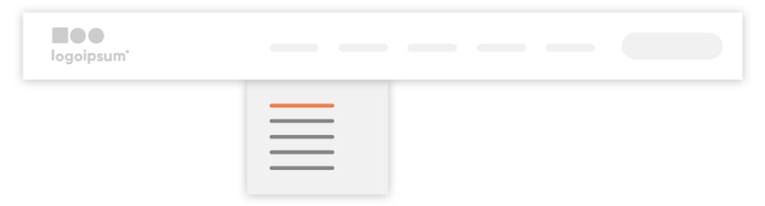
The Dropdown Menu
This is a handy way to hide complex lists of products or services to keep the horizontal navigation clean and simple. Here you can list out links to all the pages within your site map in an organized set of groups.
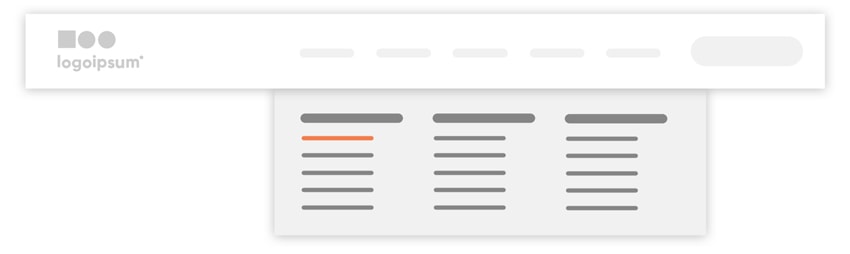
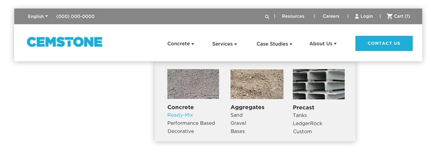
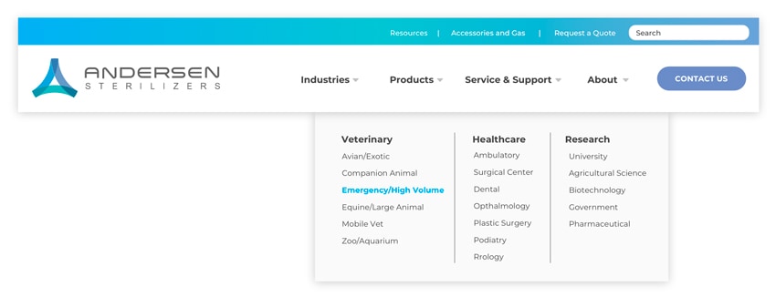
The Mega Menu
This is a dropdown menu that displays a much larger set of options spanning the whole width of the screen. With more space, you can display multiple categories, lists, short explanations, or even images. This gives a visitor a sense of the breadth of your offerings in a single glance, and it acts as a nice visual “Table of Contents” of the content in this section of your website.
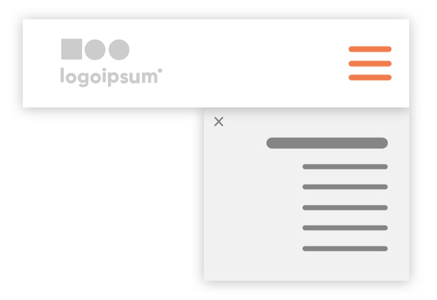
The Hamburger Menu
The hamburger menu icon is made up of three horizontal lines that, unsurprisingly, look like a hamburger. It’s a universal symbol that means “menu.” While some B2C companies use this on all views, for B2B industrial companies we recommend using this ONLY for tablet and mobile views, so that the navigation remains visible, and as clear as possible, for all visitors (who are primarily using a desktop computer anyway). When expanded, the hamburger menu generally displays a stacked version of your main navigation.
Sticky Headers
Also referred to as persistent headers, this common pattern keeps the horizontal navigation at the top of the screen while the user scrolls down the page. Sometimes the navigation will collapse into a small, condensed version to allow for more screen space, but the crucial navigation links remain in view at all times.
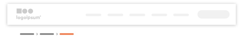
Breadcrumbs
Breadcrumbs provide a visual clue to the hierarchical structure of your website. They typically appear horizontally, just below the navigation but above the page title. They provide a map of how the user ended up on the current page. Site visitors don’t always use the “front door,” meaning they don’t always enter through the homepage and follow a hierarchical browsing pattern; search engines can drop them anywhere on the site. Breadcrumbs help signal to a user where they are within the website, so they can navigate successfully from there.
The Secondary Navigation
When absolutely necessary, a secondary navigation can be home to content that is of secondary interest to the user. We typically steer away from these, in order to keep the navigation as a whole clean and simple, but sometimes secondary navigation can provide great accessibility for larger, more complex websites. These bars typically appear in a lighter or less prominent color than the main horizontal navigation.
Choosing navigation styles for a B2B industrial website
With so many navigation options, it can be hard to determine which ones will work best for your website. A good rule of thumb is to look at what people in your industry with up-to-date websites and well-developed marketing strategies are doing. This can be harder to find in B2B industrial and manufacturing sectors, where you can often beat the competition simply by having an up-to-date, user-friendly website. Sometimes you’ll have to look at larger companies or adjacent industries to find great examples.
The above navigation styles are common patterns across the web for good reason—they work. Users are accustomed to, and expect, a lot of these styles and if they have to re-learn a whole new experience when visiting your website, you risk losing them.
Regardless of which navigation styles you use, the end goal is always to guide the user through the website as quickly and easily as possible. Your navigation is the roadmap to your website, and you want visitors to be able to find the information they are searching for. So, naturally, the navigation (and organization of the site as a whole) should be oriented toward your ideal prospect.
Building a website navigation strategy
In order to organize a navigation that makes sense and meets the needs of your customers, we start with a few simple questions. These may seem rudimentary, but having them written out will help you build a fundamental navigation strategy. People want to understand, first, whether you can help them, i.e., solve their problem. After that, they’ll be interested in answering deeper questions.
When developing a navigational strategy, ask yourself first:
Who is your target audience and what information are they looking for on your website?
Most often, the answer sounds a lot like “Potential customers visit my website are looking to solve a problem, find a solution, or innovate in some way.” They’re often engineers looking to source my product, or referrals looking for reasons why they should prefer my company over my competitors.
A well-strategized navigation structure will answer these questions for the target prospect, in order:
Q: How can you solve their problem?
A: Our products can help make their job easier.
How this translates into navigation: Products/Services/Solutions
Q: Have you solved similar problems before?
A: Yes, we can showcase proof of our success with past projects.
How this translates into navigation: Case Studies/Applications/Industries
Q: Can they trust your company?
A: Yes, we have been doing this for over 20 years.
How this translates into navigation: About Us
Q: How else can you help them?
A: We have how-to guides for our products.
How this translates into navigation: Resources
Q: What is the next step, what do you want them to do?
A: We want them to reach out and talk to one of our sales reps.
How this translates into navigation: call to action (CTA), contact form, Get A Quote, Request Info
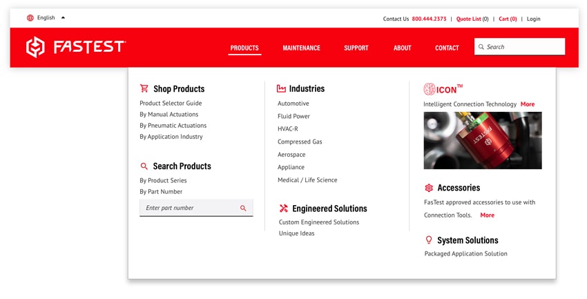
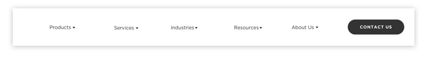
After answering these questions, a very simple website navigation that mirrors the target audience’s thought process in evaluating a vendor or supplier might look something like this:
Once you have the main concept for your navigation you can start to add in other details and elements as necessary.
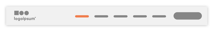
Additional navigation elements
Logo
Presenting your logo signifies ownership of content and acts as a “you-are-here” mechanism. The user should know at a glance exactly whose site they are on. The most easy-to-understand user interface will place the logo in the upper left. Veering off this pattern could potentially cause confusion as a new visitor quickly scans your website to determine who you are and what you do. The logo is also commonly linked to the homepage.
Language Selector
A language selector allows the user to switch between language options for reading your content. It’s a great localization tool to make your website as accessible to users as possible. There are many different tools and translators that can be used, so you don’t have to manually translate all your content. A language selector is typically found in the top left corner of the site.
Interactivity
A common pattern to signal interactivity is an arrow next to a main navigation label. This signals to a user that they can expect more information to appear in a dropdown menu with a click. Additionally, you can use hover effects, like a subtle color change, to signal links within the dropdown menu.
Descriptive Labels
Sometimes it makes sense to get more descriptive with labels. For example, if you only provide one type of product, like “Sensors,” you can use this instead of a general “Products” link. This creates a mental shortcut for users to immediately understand what you sell. These descriptive labels can also help search engines more quickly understand what your website is about.
Ecommerce
If your site has ecommerce functionality you’ll likely need to include a shopping cart or login link. These typically exist in the utility navigation but can also exist in the main horizontal navigation, if this is a major function of your website.
Phone Number
In addition to a CTA or contact link, you can also provide a phone number in the navigation. This makes it as quick as possible for a user to contact you without having to fill out a form or dive too deeply into your website. However, include this only if you want prospects and visitors to contact you by phone, and have someone readily available to answer those calls and questions.
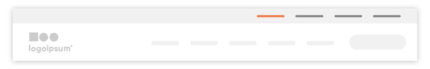
A fully designed main navigation
A fully designed main navigation might look something like one of these options:
Often taken for granted, website navigation might be one of the most overlooked aspects of user experience and website design. It’s definitely worth the time to sit and strategize what navigation styles and practices work best for your website.
While we do recommend playing by the rules, there’s always a place to break them, too. You’ll soon figure out what navigational elements are most important to your business and what works for your audience.