

Content performance is one of the most important aspects of your industrial website. At the same time, content can be one of the most time-consuming assets to produce.
Before taking major steps to improve or augment your content—and as part of ongoing efforts to keep your content fresh, relevant and engaging—it’s important to understand how your current content is performing. Knowing where you stand helps you focus your efforts where they matter most. Sometimes a small change can move one of your website pages from the second page of search engine results to the first page, making a big impact on your overall SEO performance. Furthermore, finding patterns in the performance of your current content helps you steer new content toward the best performance possible.
Setting goals for content performance — prioritizing metrics for B2B industrial websites
Because modern marketers have so much potential data at their fingertips, it’s easy to fall into a rabbit hole of irrelevant information instead of focusing on the metrics that matter most. Reading general best practices articles can be helpful, but your goals as a marketer for a B2B industrial, manufacturing or technical company are likely to be different from the goals of a marketer for, say, a consumer packaged goods brand or a restaurant. Content performance metrics for B2B and industrial marketing are generally going to align with leading indicators and lagging indicators that indicate a higher quantity and quality of leads from your industrial website—both MQL conversions and SQL conversions.
While social media is an important avenue for amplifying your content’s reach and finding new audiences, and email marketing and ABM strategies also heavily involve content, this article focuses primarily on the content housed on your marketing website. Your industrial website is the hub of your marketing, and content initiatives typically link back to it, so it’s usually where we advise our clients to focus first.
Choosing your tools to measure content performance
With the seemingly endless array of analytics tools available these days, knowing where to start can be its own challenge. If you’re just beginning, or haven’t delved into Google Analytics yet, that’s the best place to begin. Once you have a handle on it, explore the rest of the list: HubSpot, HotJar, SEMrush and Google Search Console.
- Google Analytics: This is the most commonly used tool. There’s no license fee; it’s a free tool that allows you to track visits to your website. You can dial into where visits originate geographically, how visitors are finding you, what pages they land on, which pages are viewed the most (or for the longest) and which are tied to conversions. Audience Overview offers insight into the quality of your traffic, such as pages per session, session duration and bounce rate. Acquisition Overview provides clarity on the source (channel) bringing the traffic to your site.
- HubSpot: If you’re using HubSpot as your CRM and marketing automation tool, it allows you to dial deeper into analytics around how your prospects (MQLs and SQLs) initially converted, and how they have since engaged with your marketing.
- HotJar: To understand how visitors engage with your content on the page itself, HotJar (or other similar heatmapping tools) show you where visitors move their mouse, where they click and how far they scroll.
- SEMRush: This is one of the most effective SEO tools for an all-around perspective on keyword and content performance strategy.
- Google Search Console: This tool is ideal for identifying organic traffic trends. Impressions, Clicks and Average Position allow you to see how well your keyword strategy is working. This tool also identifies more-technical issues that can affect your site performance.
Using Google Analytics to understand your current content performance
You can use Google Analytics to understand who’s visiting your site, which pages are looked at the most, where visits come from geographically, and from which channels (organic search, paid ads, social, email, referrals from other websites or direct visits to your URL). Key information to look for in Google Analytics includes traffic metrics, landing page performance, engagement, conversions and geography.
Measuring Traffic in Google Analytics
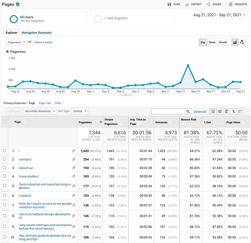
Google Analytics’ “Channels” report (Acquisition -> All Traffic -> Channels) will show you aggregate numbers and trends for all visits to your industrial website. Clicking on any of the “channel” names in the chart will show trends for that particular channel over time. Update the date filters to show the last 365 days and look for overall trends, or dial into a specific period that you want to analyze more closely.
Measuring Landing Page Performance in Google Analytics
To see what landing pages are performing the best, in terms of bringing traffic to your website, go to the “Landing Pages” report (Behavior -> Site Content -> Landing Pages). This shows you a list of the top pages that visitors enter your site on. In addition to the “Sessions” metric, it’s useful to look at Bounce Rates (lower is better), Pages Per Session (higher is better) and Average Session Duration (higher is better), to see if the visitors to these pages are engaged in your content and browsing throughout your website, or promptly leaving, perhaps because they’re not finding what they were looking for or expecting. To see how landing pages are performing for organic traffic specifically, choose a segment from the top of the screen to filter this view to “Organic Traffic.”
Measuring Content Engagement in Google Analytics
Like landing page metrics, engagement metrics like Bounce Rate, Pages Per Session and Average Session Duration can be reviewed for the site as a whole, and for segments of content, such as blog/news articles, product pages or case studies. If all of your case studies, for instance, are housed with a similar URL structure or folder, like “/case-studies/” as part of the URL, the All Pages report (Behavior -> Site Content -> Content Drilldown) will show you trends and metrics for these specific sections of your industrial website. Review this data in aggregate and by clicking on these folder names to review what content types users are spending the most time with—and the least. How does this align with your goals and your user paths, i.e., how you want qualified prospects to interact with your website?
Measuring Conversions in Google Analytics
Assuming that conversions were set up when your website was launched, you can use Google Analytics to measure what visits and patterns contribute to conversions. In an e-commerce paradigm this will be a purchase, but for many B2B industrial websites, this means filling out a form, either to talk to sales or get a quote (SQL), or to request access/registration to a webinar or a piece of gated content (MQL). Once conversions are set up, you can use Google Analytics to measure which traffic seems to be contributing most to these critical actions. Most reports in Google Analytics (including Channels, Landing Pages) show columns for goal completion. In reviewing this data, consider what channels and/or landing pages lead to the most conversions. Can you identify patterns that show which individual landing pages, or which types of landing pages or content, tend to lead to conversions?
Measuring Visitor Geography in Google Analytics
Most B2B companies have specific territories or target geographies for their marketing or campaigns, whether it’s worldwide, nationwide, specific regions/territories in the U.S., or a tightly focused local geography. To get an overview of how your visitors are represented geographically, go to Audience -> Geo -> Location. Here you’ll see the top countries that your website visits come from. Dialing into one country and then state/region will provide more granular insights.
Key Google Analytics Reports
Behavior -> Site Content -> All Pages shows what pages are being visited the most, and engagement on those pages. This insight can help you identify pages that are currently performing well, as well as pages that need improvement.

Using HubSpot to understand your current content performance
When you’re using HubSpot as your CRM and marketing automation tool, it can provide great insights on which gated content assets are creating the most MQL conversions (and which ones later lead to a deal in the pipeline, and a signed contract). As you analyze Google Analytics engagement data, you can use information from HubSpot to pair up which channels are leading to the most SQL conversions and closed deals — essentially checking your assumptions. Whereas Google Analytics data is about any and all users (to which you can apply filters), HubSpot data is about the users that are converting as MQLs and SQLs. This level of insight can become a game changer in terms of how you prioritize your efforts. Read more about this level of closed loop reporting, including step-by-step instructions, in our article Improving Lead Quality With Closed Loop Reporting.
Key HubSpot Reports: Deal Quality
- Navigate to the “Deals” section of your HubSpot account.
- Click the “Create Date” filter and select the desired date range. Since this will be a snapshot of the previous week, you can select “Last Week.”
- To download this list, click “Table actions” and select “Export view” to download as an XLSX or CSV sheet.
- Filter these deals by current clients and newly acquired leads. This exercise helps you to evaluate new leads and how they found you, and to recognize patterns in source and quality of lead.
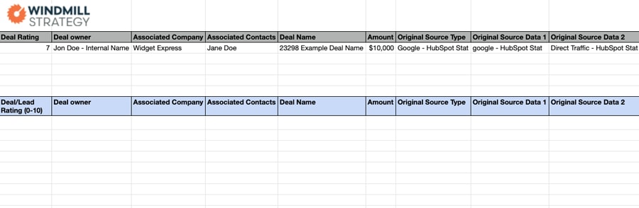

Bonus: Download your own copy of our Deal Quality Template
Using HotJar to understand your current content performance
HotJar allows you to measure how users interact with your actual page content and user experience. You can measure and analyze how far users scroll on a given page or type of page, where they click and how they interact with your content.
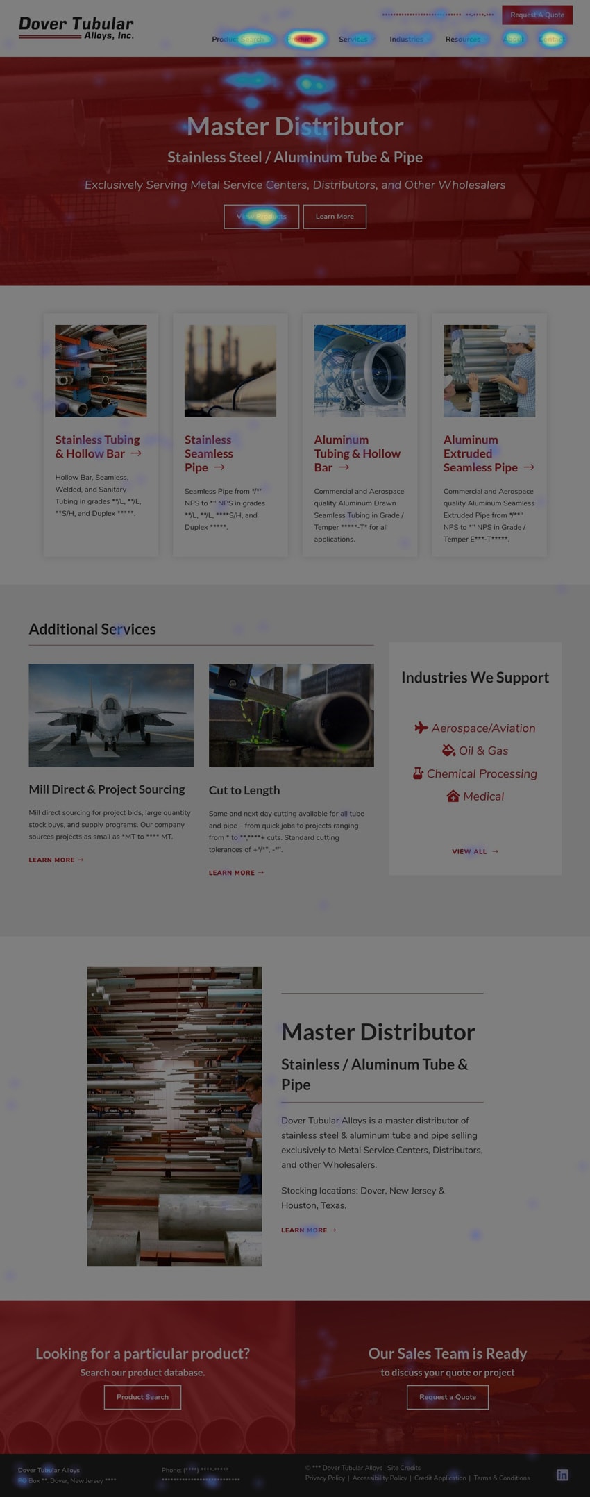
Using heatmapping tools, HotJar generates visual data about key pages on your industrial website, showing exactly where users are focusing their attention and clicking. Sometimes, users might be clicking in places that you wouldn’t have expected, where there isn’t even a link. For example, client logos on a homepage might be receiving clicks by users who expect to go to a case study, whether these logos are links or not.
If a call-to-action button isn’t receiving the click activity that you expect, it’s an opportunity to test alternate treatments or labels and look for better engagement.
Beyond recording click and scroll behavior, HotJar measures mouse movements (which show where a user is concentrating their visual interest). Data is gathered for desktop, tablet and mobile devices.
Key Heatmapping Reports
Start by setting up HotJar or another heatmapping tool on a few key pages on your industrial website, and let the software run until it’s generated at least 1,000 pageviews. Review a mobile and desktop heatmap and see whether users are clicking where you expect them to, or if there are any frustration clicks appearing (telling you that the UX might be confusing). Note that a concentration of clicks near the top of any page often represents use of the primary navigation dropdown menus.

Using SEMRush to understand your current content performance
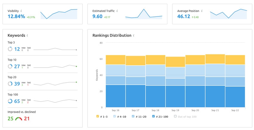
This SEO tool helps you understand how your content ranks over time for specific targeted keywords, using the Position Tracking feature. Set up a “project” for your website’s tracking and add the keywords that you’d like to track. You’ll be able to see how you’re currently ranking for these specific keywords and what pages are ranking for them. The On Page SEO Checker report also shows content improvement ideas.
The Keyword Gap feature lets you see what keywords your competitors rank for to help guide your own optimizations efforts. This feature allows you to view a Venn diagram of your ranking keywords, your competitors’ ranking keywords and any overlap.
The Site Audit feature allows for a deeper dive into site improvement opportunities. This feature will help uncover any 404 errors (which typically represent missing redirects), broken internal links or any other technical issues, on a page-by-page basis.
Key SEMRush Reports
Choose your “Project” and then go to “Position Tracking” under “Keyword Research” to see overall trends, top keywords, and keyword gains and losses in the “landscape” tab. Go to the “pages” tab to see how each individual page ranks.

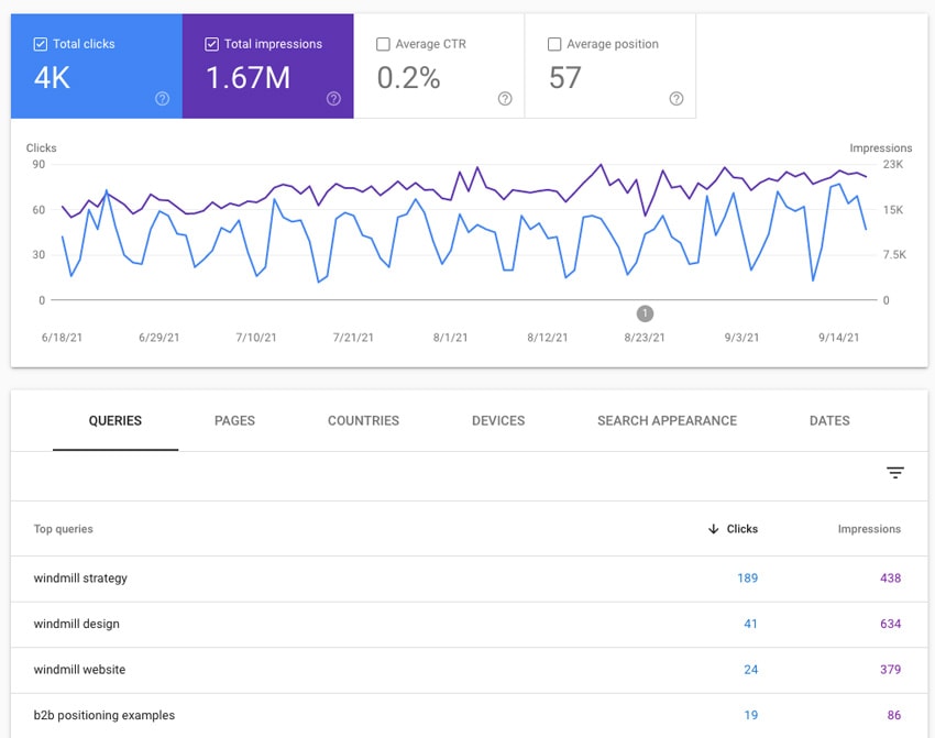
Using Google Search Console to understand your current content performance
Search Console gets a bit more technical and shows you a lot of things that you can also see in Analytics. Search Console is great for uncovering technical issues, but what’s unique here in terms of content is Search Console’s ability to show you actual impressions for any given search term. Where Google Analytics only measures actual clicks/visits to your industrial website, and SEMRush can show your rankings, Search Console can show you how many times you’re showing up in the search results for a given term.
Key Google Search Console Reports
Performance -> Search Results will show you trends over a period of time for both clicks and impressions, as well as the number of clicks and impressions for top queries.

Pairing analytics with positioning and intent
Looking at analytics uncovers a lot of data and information, but it must be viewed through the lens of attracting quality leads. If analytics are showing that people are spending time on your pages, it’s also important to uncover whether these pages are attracting the right people, with the right intention. Are the pages with the most traffic in analytics also current, relevant and aligned with your current positioning? If they’re old blog articles covering topics not central to your business or prospects, outdated product pages, bios for past staff members, or ancient news articles, for instance, visits to these pages are unlikely to convert into leads and sales. As you go over numbers and reports from analytics (quantitative data), make sure that you’re looking at things from this qualitative perspective as well.
Using analytics to prioritize and improve content performance
Once you’ve used analytics to get a better understanding of how your industrial website content is performing today, you can begin to create a prioritized plan to improve performance. We recommend that you keep revisiting your key reports to track improvement over time as well.
You’ll notice a few categories of pages and content as you get dialed in to this process:
High-performing pages
- These pages appear frequently as landing pages, and may rank in the top 10 or top 20 results for key search terms. Focus first on the ones that are close to page 1 results, or appearing lower on page 1; an incremental boost makes the biggest difference here.
- What incremental or UX improvements can you make to pages that are already showing good traffic levels? Could adding a video, additional imagery or in-depth content on a page with a lot of traffic keep people on the page longer?
- Do your high-traffic or high-ranking pages have clear options for delving deeper into content, and an opportunity to convert as an MQL or SQL? What incremental or UX improvements can you test on pages that are already converting well?
Under-performing pages
- What critical pages or types of pages are not performing well and need to be boosted? How do these pages compare with your high performers? In what ways can you modify these pages, through content changes, SEO or UX, to improve their performance? Are you seeing pages with a number of “frustration clicks” that could benefit from a more clear user experience and CTA buttons?
Over-performing pages that aren’t relevant to your mission
- When you uncover pages that show a lot of traffic, but don’t fit your current positioning or marketing priorities, is there a way to modify that page’s content to better fit your positioning?
- If there isn’t a clear path to modify the page, then it’s best to do away with it — otherwise it’s likely impacting your bounce rate and confusing Google’s sense of “what your site is about.” In these cases, you can choose to either keep the page on the site but “noindex” the page, or delete it. When you “noindex” a page, you’re essentially asking Google to ignore it. This avenue makes sense if there’s an occasional use for the page (for instance, it’s an old product that you’re not promoting, but that you hand-sell to a few legacy customers). Otherwise, if the page isn’t helping your marketing mission, it’s best to remove it from your site and submit a redirect to Google for a reasonable alternative page.
Analyzing your current industrial website content can be a fascinating process—daunting at times, especially at first—but as you establish the process and continue with it, it becomes an ongoing source of valuable marketing intelligence.