
How to Construct a Homepage That Turns Visitors Into Leads


Did you know when your prospects land on your website’s homepage, they’ll only spend about 10 to 20 seconds viewing your content before deciding to stick around or visit a competitor’s site?
User-experience expert Jakob Nielsen says you need to communicate your company’s value proposition within 10 seconds to earn several minutes of the prospects’ attention. And, in this era of information overload and multi-tasking decision-makers, your messaging must be clear and compelling.
Donald Miller of StoryBrand says your homepage is not the place to be cute or clever. You only have a few seconds of your visitor’s time and need them to understand what you do, who it’s for, and why they should care. The homepage is your chance to make a meaningful first impression with your target audience. It’s where you generate trust with prospects and help them conclude whether your company is the right choice for them.
What are the ingredients of an engaging homepage? What’s the right balance of words and images? Where do you place your call to action or CTA? What content belongs on the homepage?
These are the questions we hear every day from B2B clients eager to capture the attention of time-challenged prospects. Below are several guidelines we follow to maximize visitor engagement for your website’s most important page. Ultimately, the path to the perfect homepage is a long-term exercise in continuous improvement.
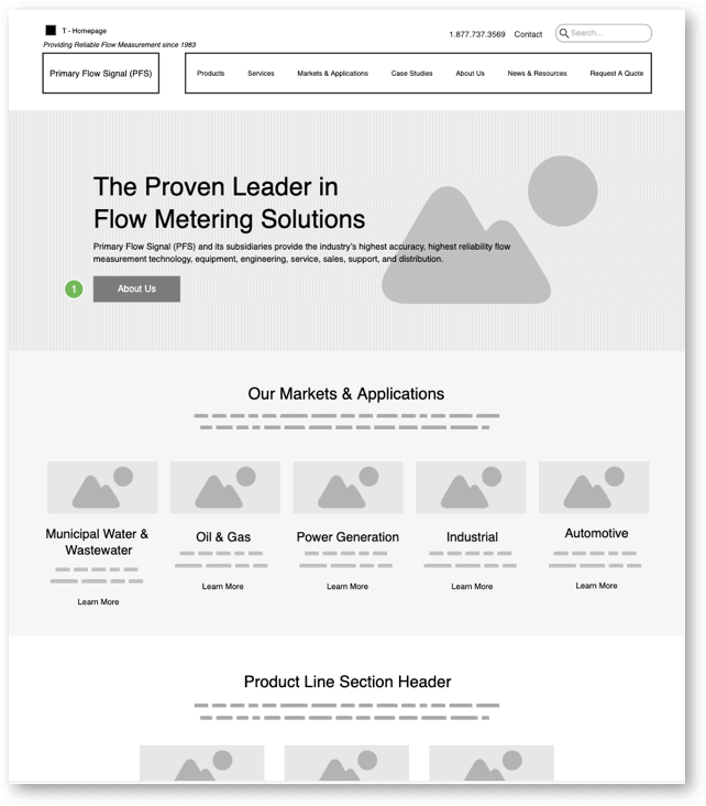
Wireframe Example
If possible, use the homepage to highlight a “CliffsNotes” version of your offerings. Again, be clear. The homepage should deliver your company’s executive summary, and provide a “skim and dive” style collection of headlines and snippets that provide quick bursts of skimmable information, and shortcuts into deeper content. Help your visitors quickly decide whether they’re in the right place or not. If they are in the right place, and seeking what you offer, make it easy for them to contact you! If they’re not ready to talk to sales yet, creatively present content that helps them answer the question, “will this company help me solve my problem or achieve my goal?” and give them a path to stay engaged with your brand. Nudge them to contact sales or make a soft conversion when they are ready.
How to Construct a Homepage That Turns Visitors Into Leads
Top of the page
The top of the page is where you’ll find global elements such as your navigation, logo and a company tagline or positioning statement. Place the logo in the upper left (because people read left to right). The tagline or positioning statement, also in the upper left, communicates immediately what your company sells and to whom throughout the site — this is especially important for visitors who find you via search, who may experience a page other than your homepage as their first introduction to your company.
Include a phone number in the header along with a contact link — differentiated from the other navigation. This area is sometimes called Utility navigation. Position your Search function here, as well.
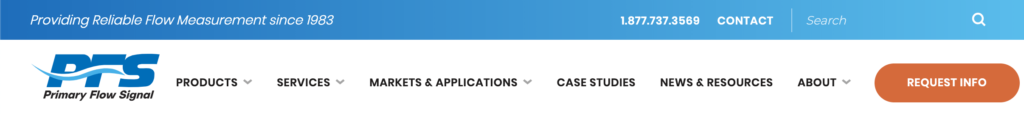
Use traditional navigation
From the standpoint of an experienced web design company we encourage you to display your navigation across the top of the page and avoid the so-called hamburger menu you experience on your smartphone, except, of course, in the mobile experience itself, where it makes sense. A lot of people don’t yet recognize this icon as a menu and will become frustrated. Users who understand what it is still must click on the icon to reveal the navigation, thus adding another step to retrieving your content. Visible navigation acts as a quick visual index of your offerings, and eliminates friction in the user experience.

Choose your site’s navigation categories through the eyes of your customers. How do they see themselves? What problems are they looking to solve? What content groups are they more apt to use while viewing your site. Not sure? Ask them.
If you offer a few products or services, don’t use the label Products as a nav item. Instead, use the product name or categories — Venturi Flow Meters and Flow Monitors — for instance.
What’s more, be mindful that visitors will browse your site using different paths. Some, particularly repeat visitors, will head straight for the navigation. Others, especially those who are new to you, will scroll down the homepage to take it all in in a more narrative form. Still others prefer using the site’s search function.
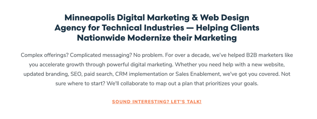
The hero
Every website needs a strong positioning statement below the navigation and above the fold. Always express this message as simply as possible. For instance, you can depict your positioning statement as: “We do _____ for ______,” followed by a reassurance statement, which provides more detail and a CTA. Furthermore, reserve this area for the hero image — your homepage feature illustration or photograph. The best hero images reflect how you help your prospects while also generating trust.
Here’s how we present Windmill Strategy as a web design company:
- Tagline — “Modern Marketing for Technical Industries,”
- Positioning statement — “B2B Web Design and Digital Marketing”
- Reassurance statement — “We help B2B, technical, industrial, life science and manufacturing companies achieve increased visibility & engagement, stronger branding, higher quality leads, and greater marketing ROI to accelerate growth.”

A word about over-sized hero images
Although it’s considered trendy, we recommend you don’t extend the hero over the entire browser screen. Instead, entice visitors with at least a partial view of what comes next on the page so that they continue to scroll down.
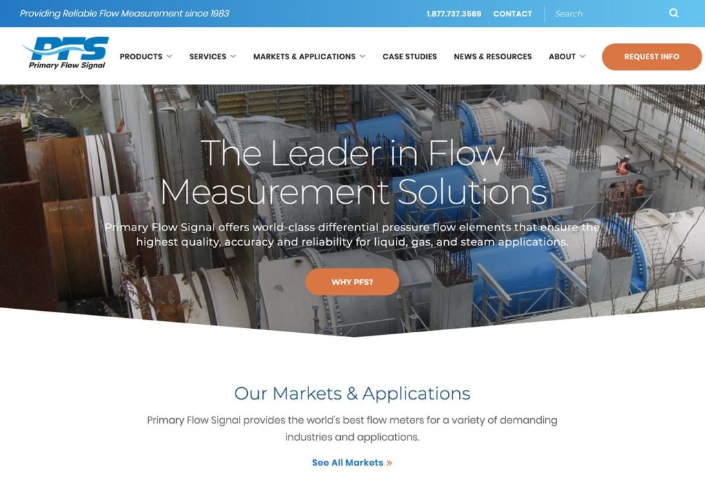
What comes after the “hero”?
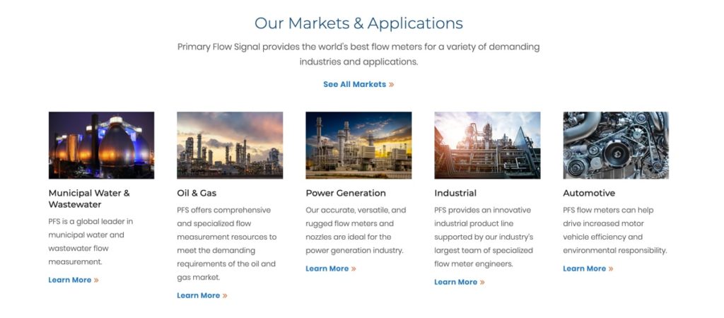
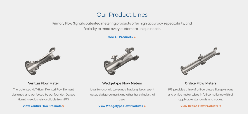
The next portion should contain overview information that continues to educate around how you can help — like your products and service offerings, and what markets you serve. The specific categories will vary based on your company and your prospects’ needs. These could include groupings like:
- Products and services
- Product applications
- Industries
- Personas (e.g., patients, physicians, hospital administrators)
Present this information in a way that it provides meaningful, but short and skimmable text, as well as links to more detailed content. We often utilize a square element we call “cards” for this type of content.
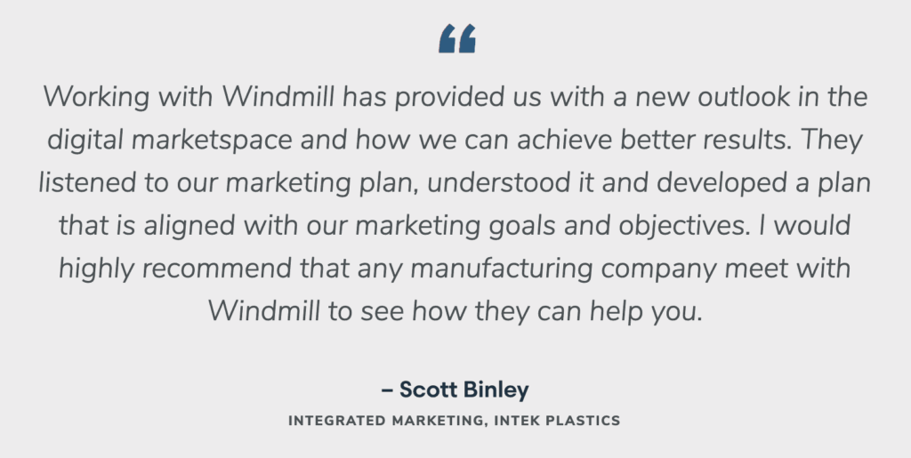
Show social trust
Social trust, in the form of testimonials and case studies, is invaluable because of the content’s objectivity. The homepage can include short testimonial quotes from customers, logos of your key client companies and links to detailed case studies.

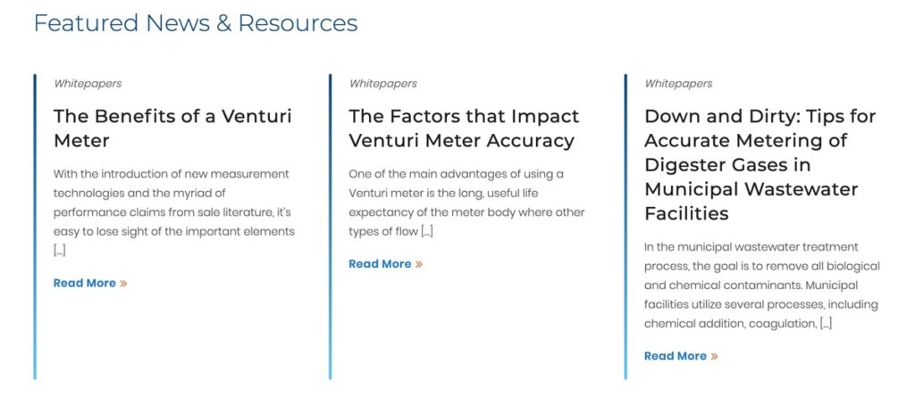
Share thought leadership
Thought leadership content, in the form of blog articles, white papers or e-books, can also be presented on the homepage, toward the bottom of the page. Good thought leadership content developed by your own team of experts educates and informs your audience while building credibility. It shows people what you believe, and what you’re an expert in, and gives them a chance to get “inside your head” ahead of talking to sales.
Display prominent calls to action (CTAs)
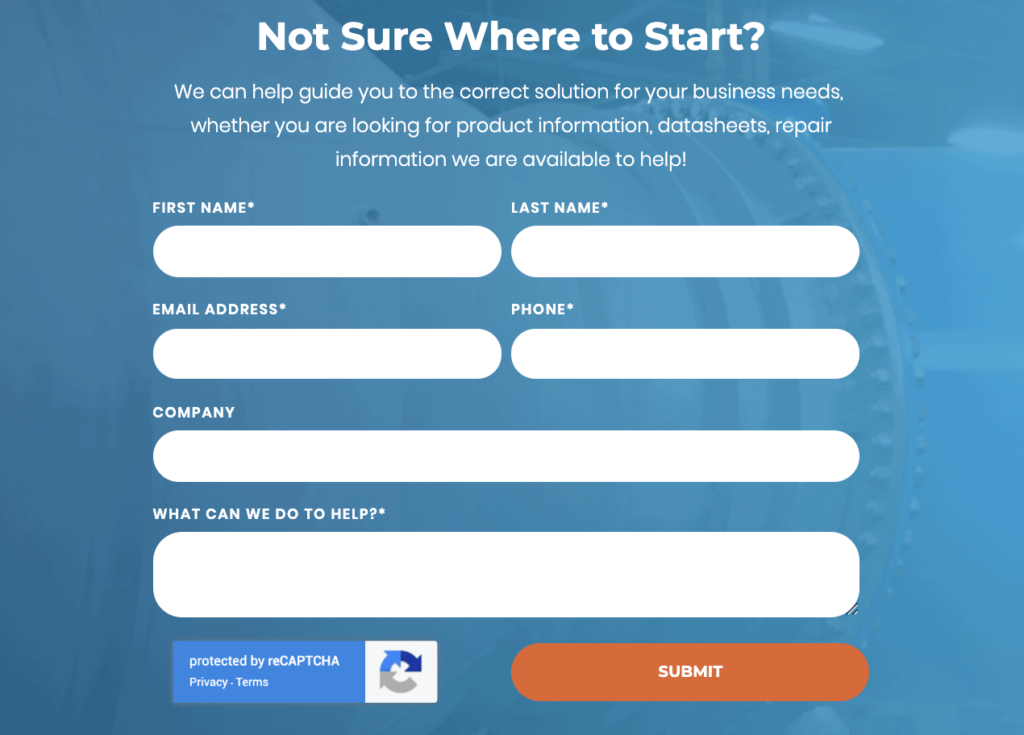
Always include prominent calls to action on the homepage. If the page is long, instead of only presenting a compelling CTA with a form toward the bottom of the page (few visitors will scroll your entire page), consider also showing a CTA midway through the page.
Example 1
Example 2
An Exercise in Continuous Improvement
A well designed and constructed homepage sets the tone for your website. Visitors make decisions within seconds if they want to explore your content further or click off to another site. With unique images, variety, and benefit-oriented copy, you’ll reduce bounce rates, and have a much better chance of turning your visitors into leads.
And chances are, you won’t hit a home run your first time up. Again, creating striking and compelling homepages is an exercise in continuous improvement. You’re never one and done. Pay attention to how far people scroll using tools like HotJar, and watch engagement metrics on Google Analytics with each iteration.
Looking for a web design company to turn more visitors into leads with creative, yet effective website design? We can help